
Tana Green


I served as Lead UX Stakeholder on the Apollo Stakeholder Review (ASR) board, partnering with the UI design lead, and React development lead, approvals required our unanimous consent, managed by our product owner. I directed senior UX designers on standard documentation for consistent reviews, co-managed a contracted pattern agency with two ADS designers, and partnered with a UX researcher who ran usability scoring.
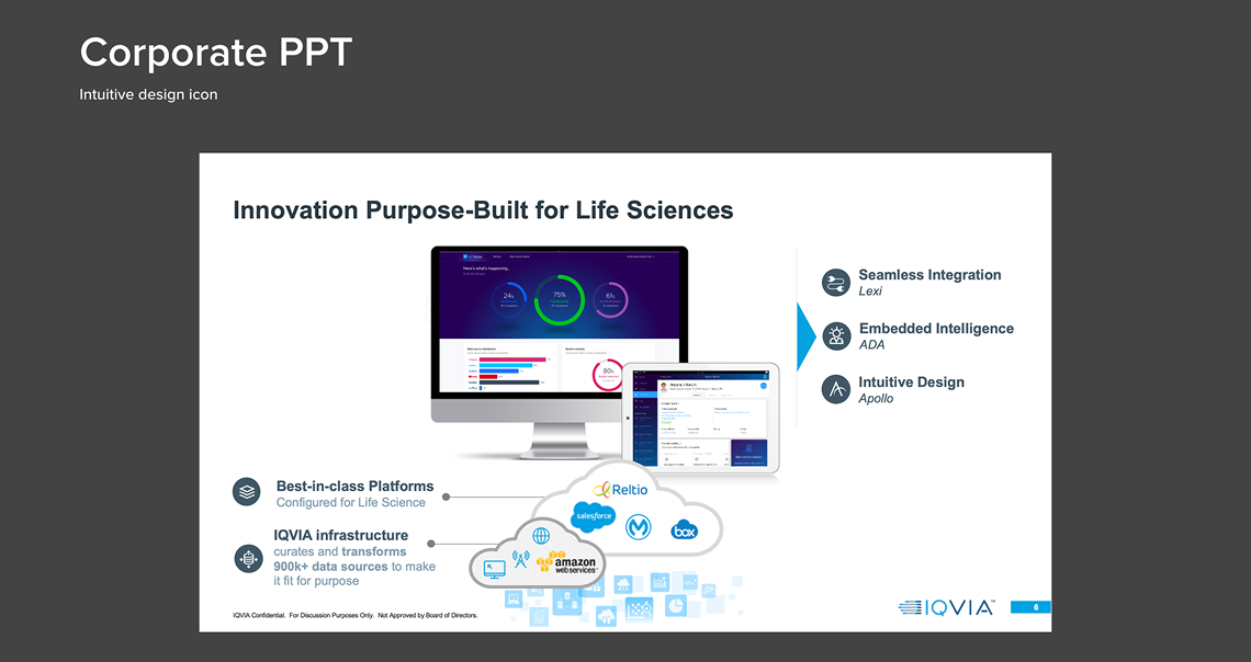


The Apollo Design System (ADS) was positioned as a key differentiator for intuitive, industry-leading visual design across IQVIA products. In the phases before my involvement, UX design, UI design, and React development worked with limited coordination. These teams had produced a complete component library, a UI kit, and custom UX, but with significant gaps between what was designed and what could be built consistently. For about half a year I served as the Lead UX Stakeholder on the Apollo Stakeholder Review (ASR) board, the internal body governing UI components and patterns. My shared responsibility was to bring the three disciplines into one accountable approval process and to define what "approved" actually meant (consistent design and viability). I worked as an individual contributor and reviewer rather than as a people manager, setting criteria, directing design revisions, and casting one of the votes required for any component to enter the shared libraries for product deployments.
Strategic alignment. The Apollo Design System was positioned as a key differentiator for intuitive, industry-leading design across IQVIA products. I tied component-level decisions to that enterprise goal: the acceptance gate existed to make standardization the organizational default while leaving a defensible path for justified exceptions.
Value and benefits realization. The work converted fragmentation into reuse. Shared components and vetted patterns eliminated duplicated efforts and inconsistency across product teams.
Compliance and feasibility. I folded accessibility analysis and heuristic categories into the system’s standards, embedding those considerations into components rather than treating them as afterthoughts. This was meaningful in a life-sciences and healthcare context. I also kept design decisions grounded in engineering and cost reality by aligning them to the React library from the start.
Two forces created the coordination problem the Apollo Design System was built to solve. First, rapid mergers and acquisitions had brought multiple digital product entities into IQVIA, and their varied product experiences needed consolidation under a single, consistent brand experience. Second, the accelerated growth of a front-end design and build department had spun up production across three disciplines (UX design, UI design, and React development) faster than coordination between them could mature. Each discipline produced capably in its own lane, but without a shared standard, the same component could be defined, styled, and built three different ways.
Product teams felt this most directly: they had no single source of truth linking UX definition, UI styling, and built components. A designer's intent, a UI mockup, and the developed component could drift apart, forcing teams to reconcile the differences downstream. The need was therefore twofold: a governed, authoritative component library and style system that unified the three disciplines, and a review process to keep newly acquired and newly built products converging on the IQVIA brand rather than diverging from it.
The ASR board operated on unanimous consent: the product owner, UI design lead, React development lead, and I each had to approve a component before it advanced. To make that workable rather than gridlocked, I set the initial acceptance criteria for approval, which streamlined a previously informal review. The board served two purposes: a rigorous quality check on individual product designs before product-owner sign-off and engineering handoff, and the formal admission of components and patterns into the ADS libraries. Product design reviews required teams to make their case: the problem being solved, customers and end users, engagement phase, any departure from ADS standards, and the research informing the decision. That framing kept standardization the default while leaving a defensible path for justified exceptions.
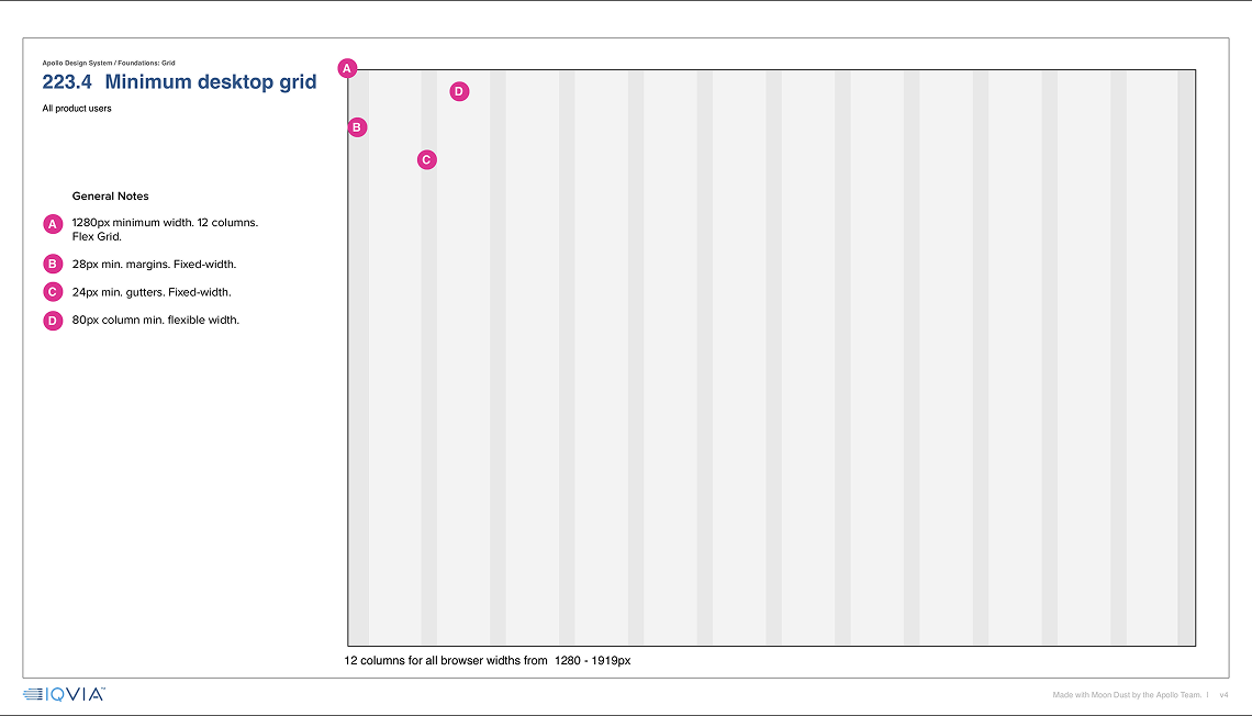
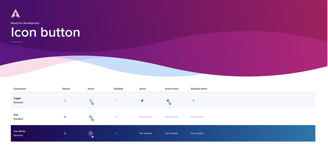
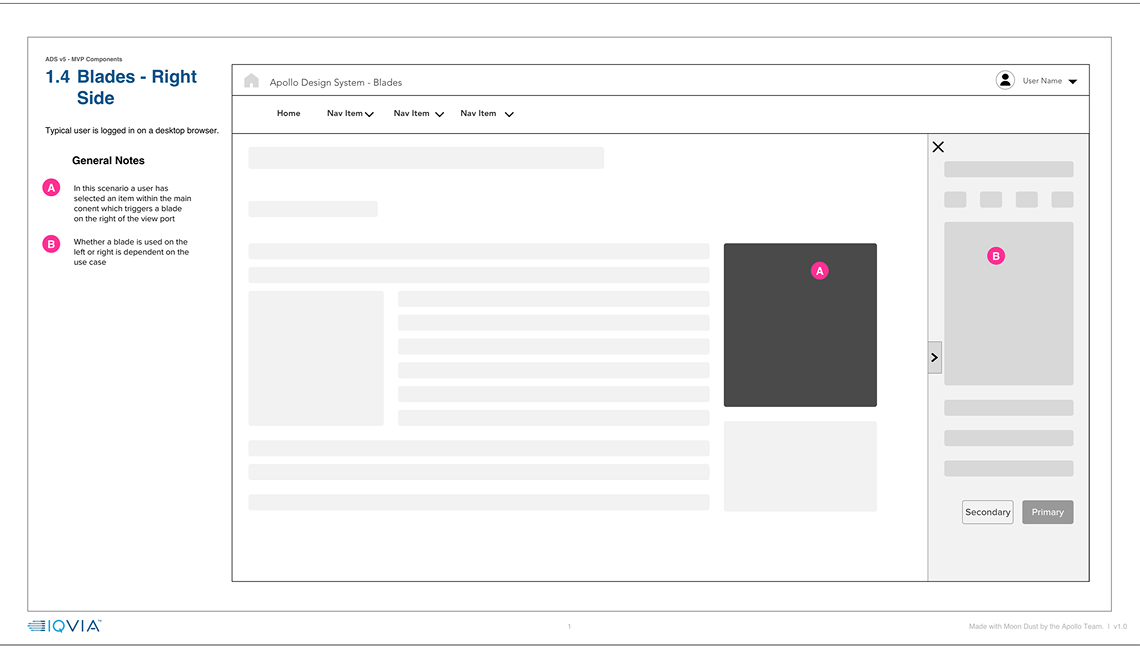
Component admission ran on a UX-then-UI track. I defined a standard 12-column grid on Material UI standards so responsive layouts stayed viable with the React library, then designers prepared annotated UX wireframes: buttons with responsive behavior, chips, and icon buttons and toggles with their full behavior states. My wireframe presentation templates were adopted by all other UX designers; more complex components came from senior UX designers and were approved after a round of revisions directed by the board. Expected UX materials included usage guidelines, annotated wireframes documenting all states and edge cases in InVision, components shown in context, and defined min/max dimensions. After ASR board approval, ADS UI designers produced final UI for every component state (default, hover, focus, active, inactive) delivered as Zeplin mockups following the ADS v4 UI kit. This UX-then-UI gate is where coordinated components entered the React development pipeline.
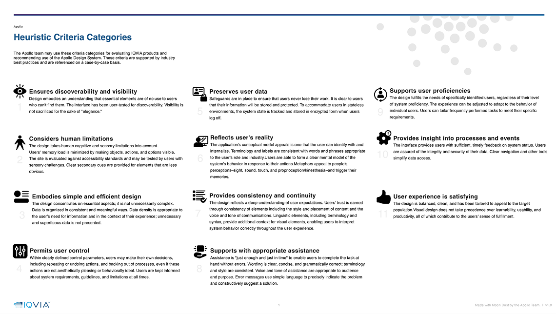
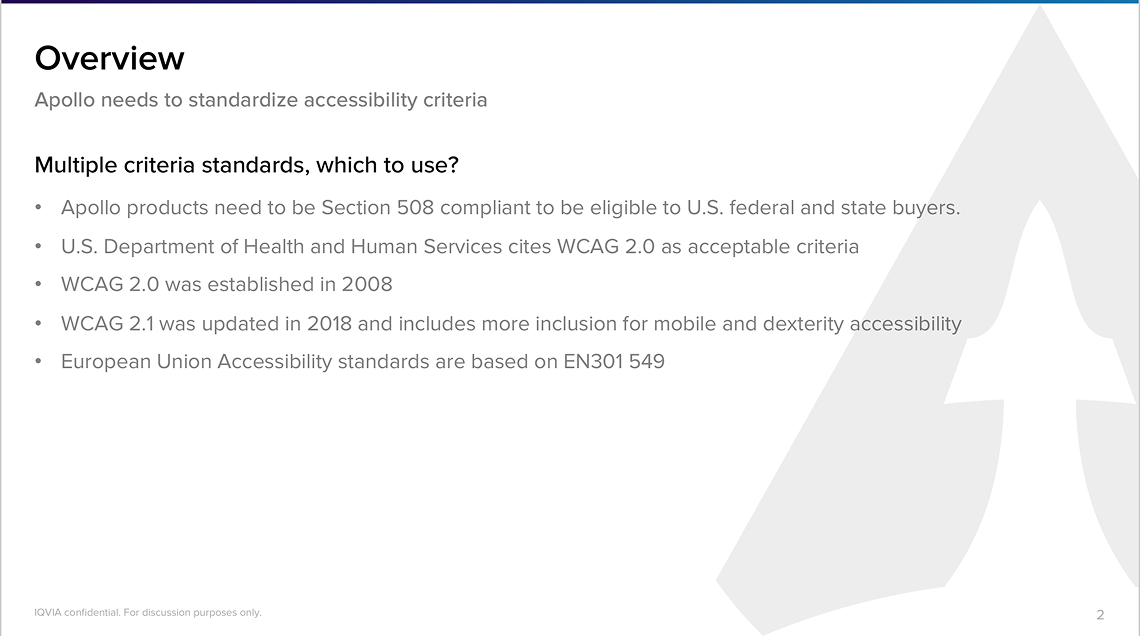
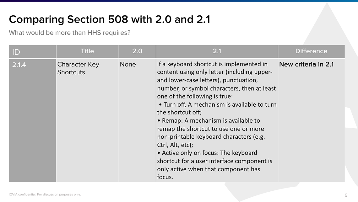
I conducted an accessibility analysis to guide the design system, comparing Section 508 against WCAG 2.0 and 2.1 and recommending WCAG 2.1 as the working standard, alongside heuristic criteria categories. This was design-system-level guidance embedded into components and states rather than a documented conformance audit.
Define team rules. My acceptance criteria and the expected UX/UI presentation standards gave every contributor the same bar to clear, replacing case-by-case negotiation.
Empower the team. Reusable templates and a shared grid let designers self-serve and work independently while staying viable in React — lowering the coordination cost of doing the right thing.
Team leadership. I co-led a consensus board spanning product, design, and engineering, surfacing and resolving cross-discipline trade-offs directly and directing senior designers through revision cycles anchored to the board's criteria.
Support team performance. I supported designers through structured critique and grounded decisions in usability evidence rather than opinion.
Rather than run the work as a linear project, I governed it as a stage-gated review with an explicit definition of done. The acceptance criteria I set (see Strategy) became the entry gate for every component, and the two-track structure separated product design quality checks from formal library admission. I also owned a procurement track: a contracted agency produced pattern wireframes under our assignment and review before anything entered the library.



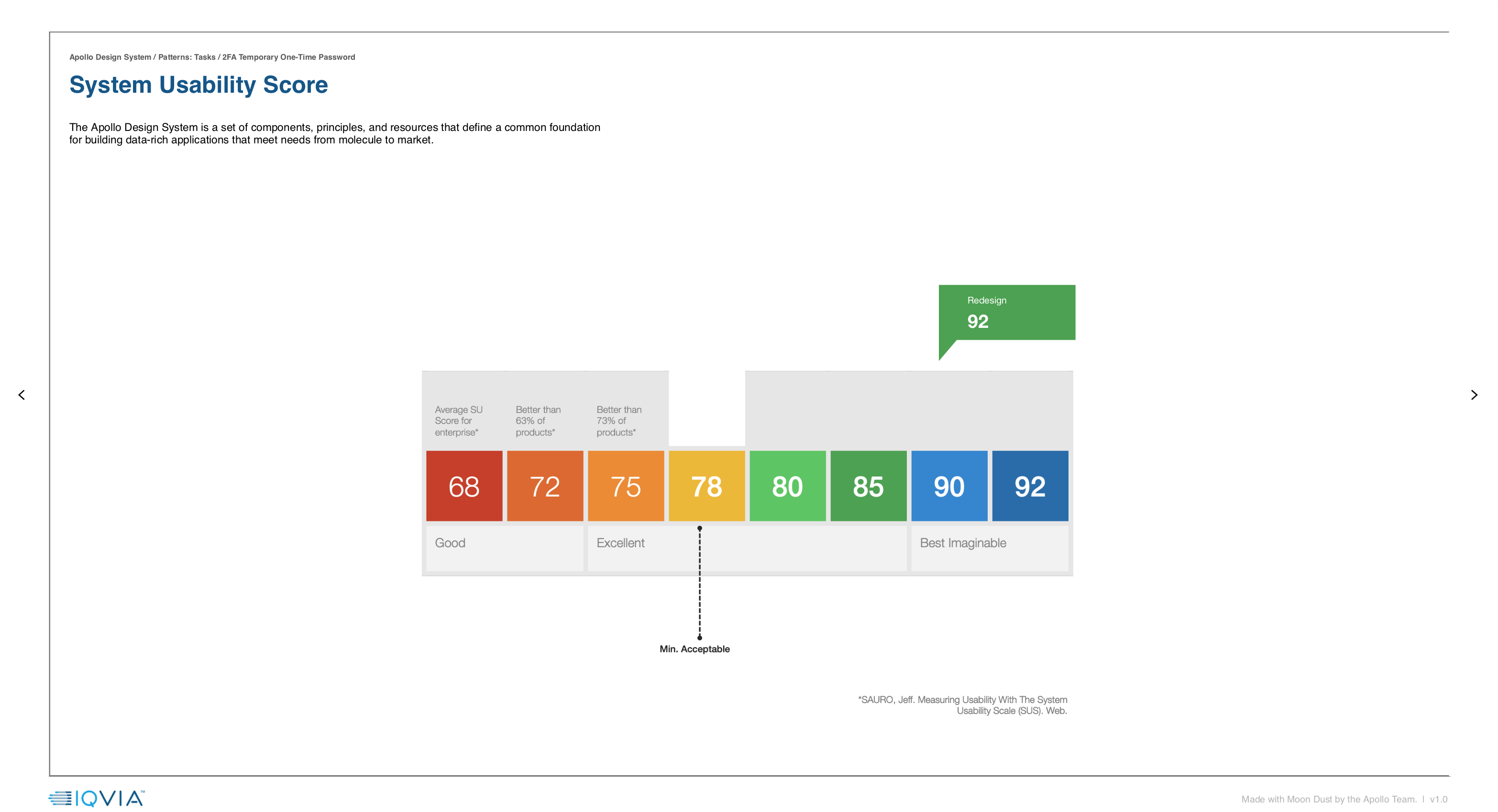
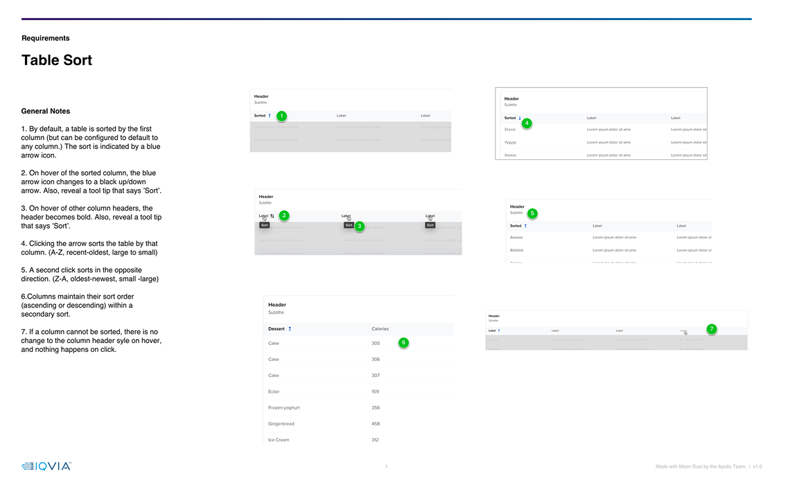
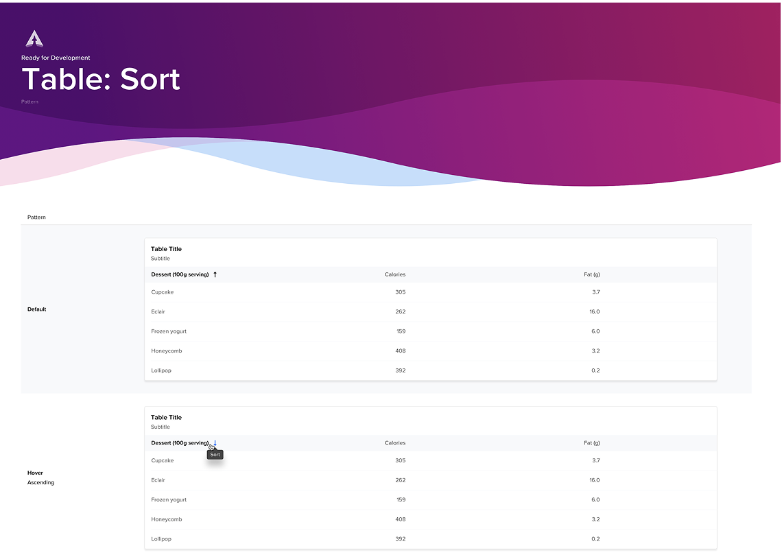
Approved work moved through a defined handoff: annotated wireframes and states in InVision, UI mockups and edge cases in Zeplin, and conformance to ADS v4 UI kit guidelines before reaching engineering. To extend the system beyond components, the team specified roughly 70 standard UX patterns that products commonly need and contracted a separate agency to research and produce wireframes for them. I and at least two other ADS UX/UI designers routinely assigned and reviewed that agency's proposals. A UX researcher then ran a System Usability Score on each pattern, and only patterns clearing that usability bar entered the Apollo Design System. Once admitted, the patterns became available to product teams as reusable starting points.

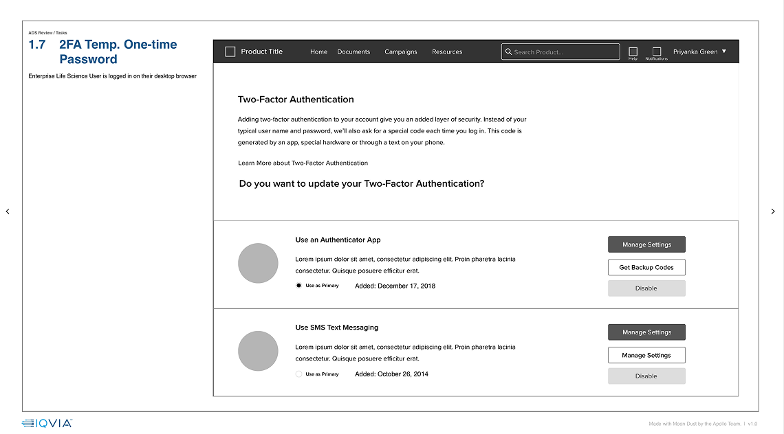
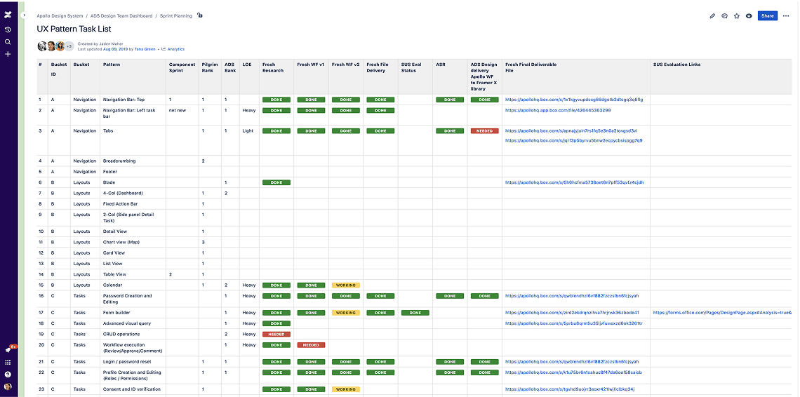
Before the ASR board was formed, component decisions were inconsistent and uncoordinated across three disciplines. By the end of my tenure, 30 of 60 coordinated components had cleared a single, criteria-based gate into the shared libraries, and roughly 70 usability-screened patterns were available to product teams as reusable starting points.
What I'd improve next:
Unanimous consent guaranteed quality but concentrated scheduling risk. One unavailable lead could stall a component. I would pair the consent model with an asynchronous review path and a published turnaround SLA, and add an adoption metric so we could show how many product teams actually consumed each approved component rather than only how many were admitted.