
Tana Green

Agency of record: Filter Digital. Tana served as Lead UX Designer on the Android handset, tablet, and web product, leading a high-fidelity UX design team that scaled from three to nine designers across the program. She set client expectations, wrote design assignments, directed and reviewed team production while delivering her own typical screens, flows, and comps. A separate designer led the parallel iOS track; the two leads collaborated and kept a friendly competition to produce assets efficiently.


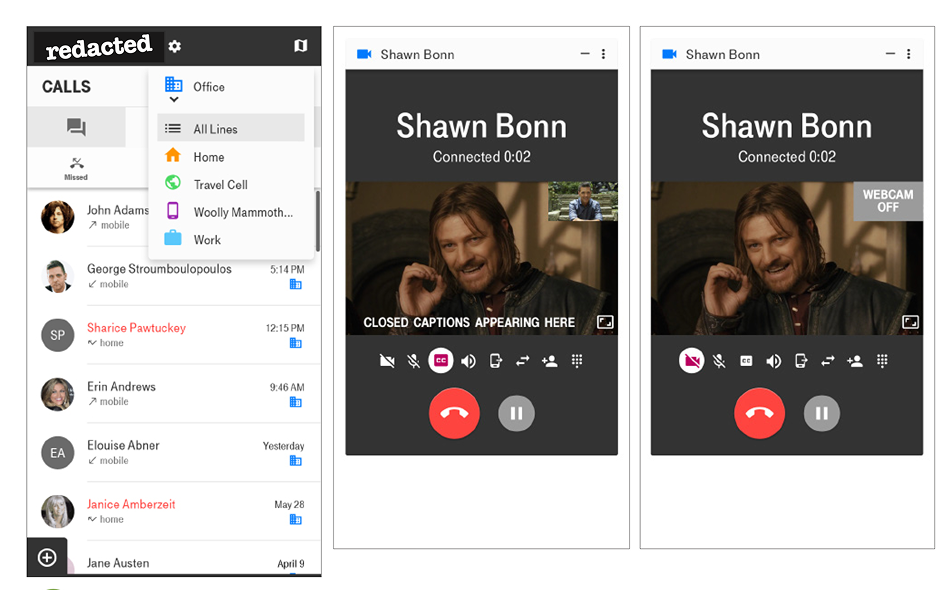

A national wireless carrier's differentiator was affording a single SIM card carry several virtual phone lines. Everyday subscribers needed to manage calls, messages, and contacts across those lines without confusion for Android handsets, tablets, and the web, in both compact and expanded layouts. Success meant one consistent pattern set that held on a small handset and scaled to tablet and web, keeping the multi-line model legible at a glance. The engagement ran about nine months, from September 2015 to June 2016, and shipped.
The work stayed tied to the product's business case: differentiating the carrier through multiple virtual lines on one SIM. The decisions that carried the most commercial weight (the default-line model per contact, the line selector, and the multitasking dock) each served that value proposition directly.
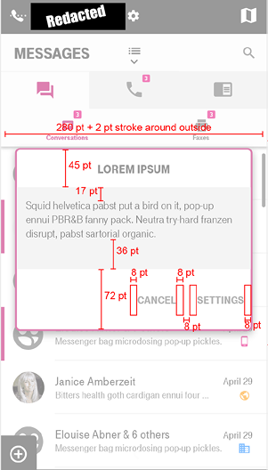
Client alignment: Tana set client expectations across the engagement and translated client requests, such as compact and expanded responsive views and redlined custom modal alerts, into build-ready specifications.
Compliance: The accessibility standard of following Apple and Google's standards for native mobile apps (aligned with WCAG 2.1 AA by FEC policy) was carried as a documented design requirement through production.
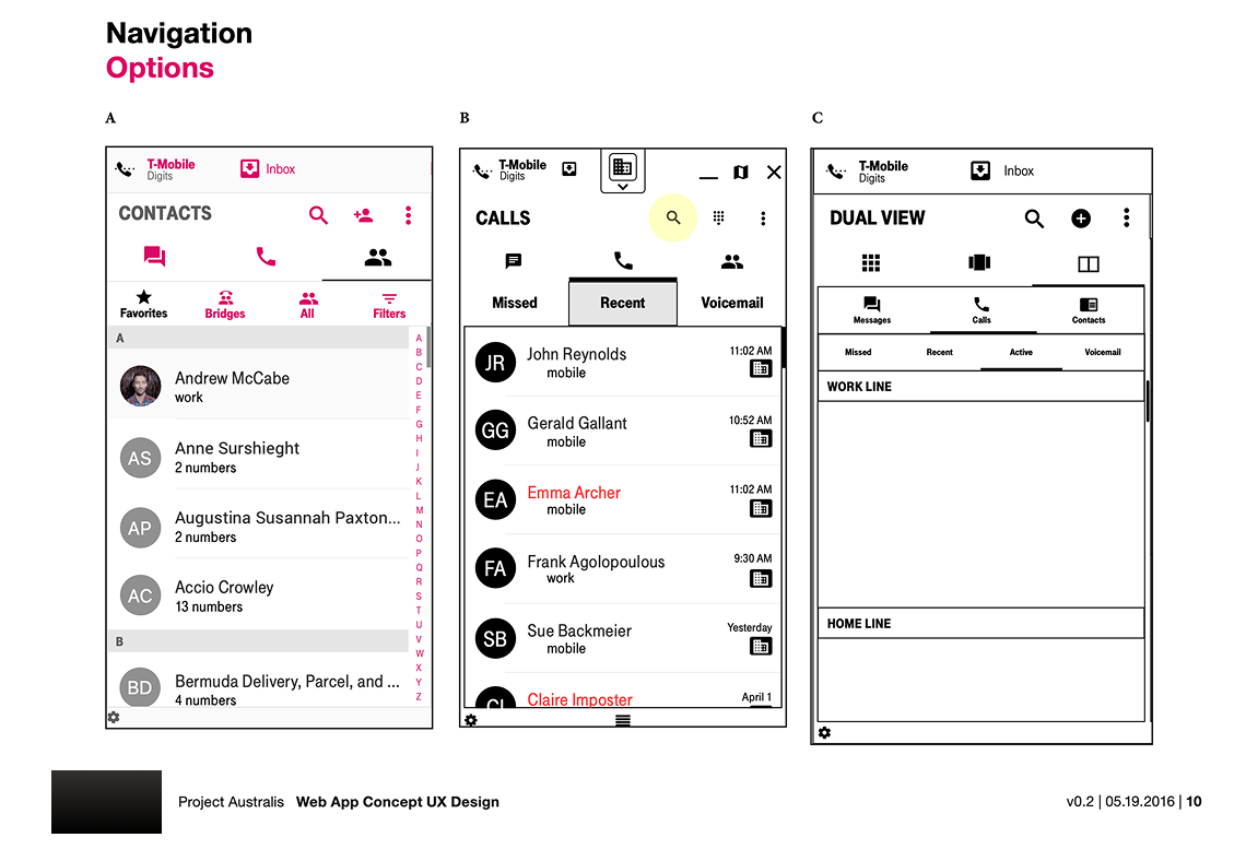
The work was organized around one promise: letting a single device behave like several. This framed two recurring problems: how a user sets and reads the default line for each contact and how a user keeps several conversations going at once. The team prioritized the primary use cases first and designed compact views to hold on handsets while expanded views used the larger tablet and web canvas, so one pattern set could stretch across all three surfaces.
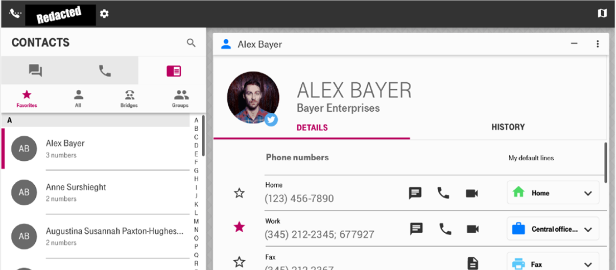
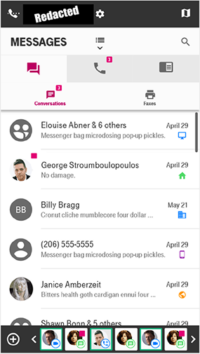
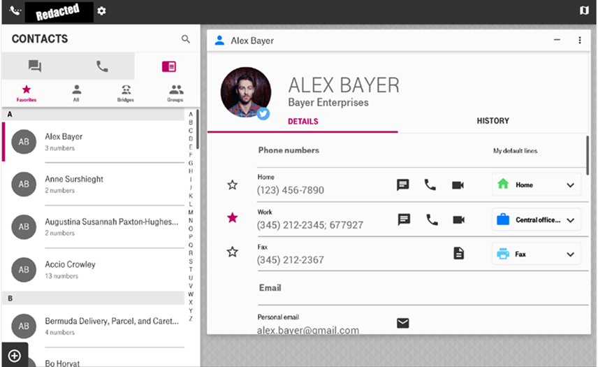
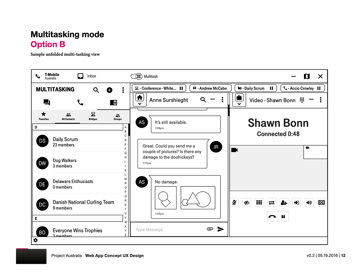
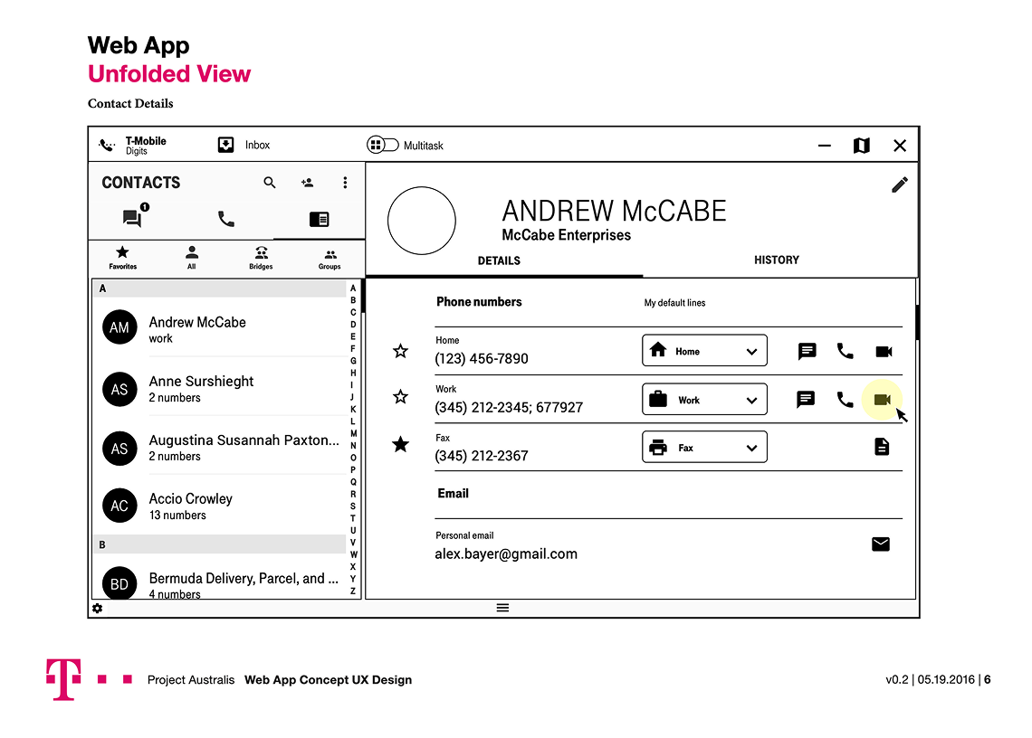
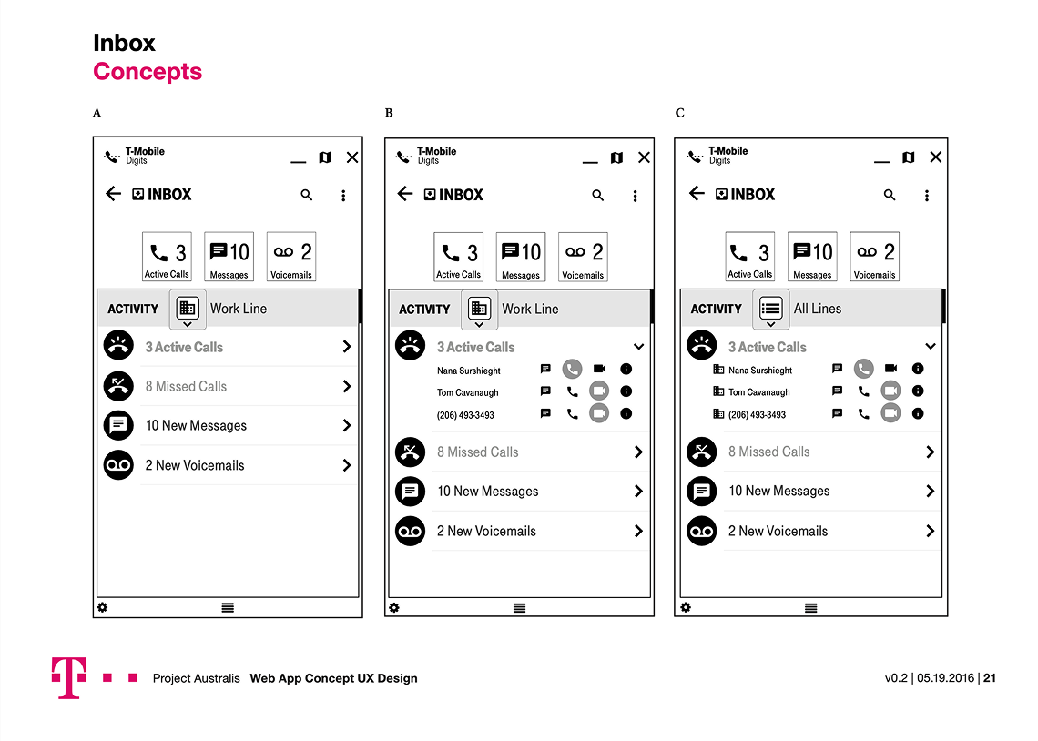
The contact detail screen anchored the system. In the compact view, a favorite contact reads cleanly on a handset; in the expanded view, the same contact appears as a card floating over a branded pattern, with controls to set the default line a contact should be reached on. The line selector lets a user with four lines choose which line's activity to show, or view all lines at once. The signature pattern was a multitasking dock along the bottom of the screen: activities appear as square chips carrying the contact's photo, an icon for communication type, and a color keyed to the line, with pink badges marking new messages and chevrons for scrolling past six visible activities.
In the expanded view, two activity cards sit side by side (a private chat and a group chat) with a pink rail marking the conversations on display and a dock holding additional activities. Accessibility shaped the patterns rather than sitting on top of them: activity chips pair a contrasting color with an icon and photo so the line and message type never depend on color alone, and every flow carries explicit empty, error, and modal-alert states, including inline validation past the 600-character message limit.

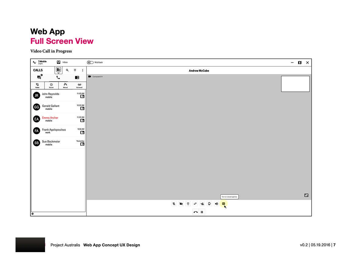
With our program manager and recruiters, Tana established the need to build and resize the team to fit each phase, expanding for discovery and production and concentrating for build-ready delivery. She led by giving designers clear ownership of individual screens and use case flows while holding the through-line herself on IA, navigation, and UX patterns. She wrote design assignments, then reviewed and provided revision notes the team's output. She partnered with the lead of the parallel iOS track, sustaining a friendly competition that kept both teams productive while they stayed consistent wherever the two products met.
Team rules: She set the design team's day-to-day working approach within the wider program structure defined by the client's team managers.
Team rules: She initiated team-level working approaches within the program structure set by the agency and client’s team managers.
Delivery ran in four phases, moving deliberately between waterfall, agile, and iterative methods as each phase required. Tana initiated team strategy for the Android and web track, sequenced a discovery phase ahead of agile production, and kept the phases documented, reviewed, and on the expected cadence.
Managing deliverables: She prioritized the primary use cases and concentrated the team from its broader discovery size down to three designers for build-ready output. This became the point where scope locked to what engineering could ship.
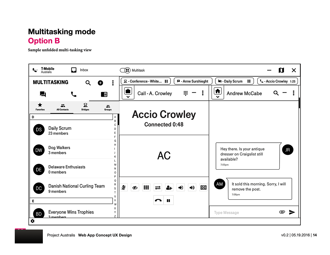

The Android and web track handed engineering a complete package: user flows, responsive wireframes, specifications, prototypes, full-color comps, and detailed redlines, including custom modal alerts and inline-error specifications.
The product shipped with one coherent pattern set across handset, tablet, and web: a contact-and-line model built around the multi-line proposition, a multitasking dock for up to six concurrent conversations, and fully specified states through to the 600-character message limit.
What I'd improve next: the case is strong on the pattern system but light on evidence and validation. I would document the discovery inputs and add at least one usability test and one post-launch signal, so the work reads as a measured outcome and more than a handoff.