
Tana Green


Founded and produced under Blur Rail, Inc., my own venture, shipping as DelayTrackerUSA.com. I held three roles concurrently — Executive Producer, Interaction Designer, and Product Manager — directing product strategy, interaction design, and the brand and icon system end to end.


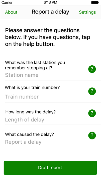
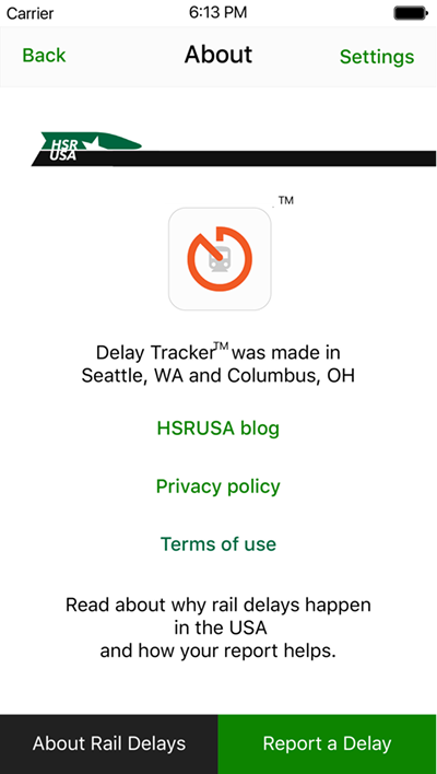
Delay Tracker is an iPhone app that lets U.S. intercity rail passengers report a train delay directly to the Surface Transportation Board. The product has a deliberately civic aim: to identify bottlenecks in the national rail system, educate passengers on the likely causes of delays, and generate data that can persuade policymakers to fund the infrastructure improvements that would prevent them. I created the product under Blur Rail, Inc., my own venture, and carried it as Executive Producer, Interaction Designer, and Product Manager— owning strategy, interaction design, and the brand system, then directing the work to a build-ready state. The brand and experience documented here reflect a refresh produced for the #RefreshMyRide campaign.
Value & Benefits — The value is civic: turning dispersed rider complaints into aggregate evidence regulators and policymakers can act on. Success is measured less in downloads than in whether that evidence reaches decision-makers.
Compliance & External Environment — Submitting reports to a federal regulator places the app in a public-sector data context, and #RefreshMyRide served as its external engagement channel.
With the thesis set, the design problem was emotional: make reporting effortless in a moment of irritation. Orange became the organizing decision— the color of rising frustration, sitting deliberately between the calm of yellow and the alarm of red in the traffic-signal vocabulary every rider already reads. That one choice unified the brand, the iconography, and the tone of the report flow, giving the #RefreshMyRide refresh a coherent point of view rather than a cosmetic update.
I mapped the full experience before high-fidelity design, then detailed the core flows — "Report a delay" and "Settings" — as wireframes, followed by Welcome, About, and Report comps. The icon system was drawn to feel familiar without being generic: informed by Material Design but proprietary to Blur Rail. Accessibility was built in at the comp stage.
Delay Tracker's comps were designed against iOS Dynamic Type, so the report flow stayed legible as riders scaled text up — accessibility built into the design rather than remediated later. This is structural alignment at the design stage, not a documented WCAG/508 conformance audit.
Support Team Performance — Produced across Seattle and Columbus, Delay Tracker required coordinating distributed contributors toward one design direction and a single release target.
Negotiate Agreements — Shipping to the App Store meant working within Apple Developer Program terms; routing rider reports to the Surface Transportation Board established the product's data pathway to a federal regulator; and Blur Rail retained proprietary ownership of the icon system.
Scope Management — I owned scope end to end and treated the #RefreshMyRide refresh as a defined change event rather than open-ended polish, holding the release to a build-ready v1.0 inside the 26-week window.
Product Management — I ran a single product thesis as the decision filter for every design and build trade-off, prioritizing the report flow as the core path and keeping About and Settings supporting rather than competing.

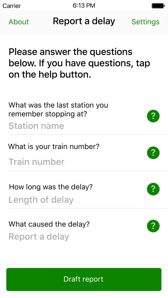
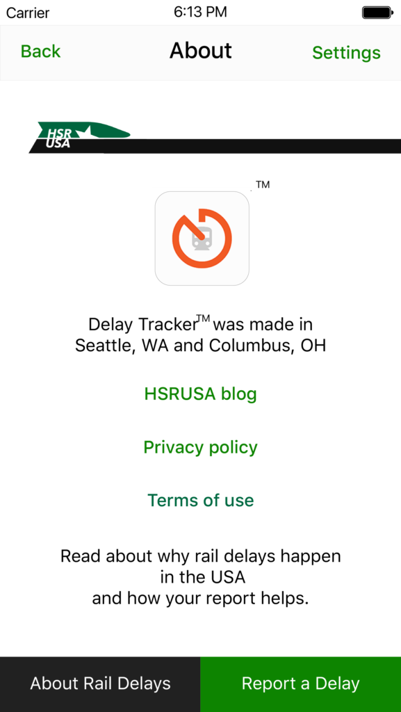
Delay Tracker shipped to the App Store as a complete v1.0 — a coherent brand, a proprietary icon system, and an accessible report flow carried through the #RefreshMyRide refresh.
What I'd improve next: I'd close the loop for the passenger. The app captured a report well in the moment, but a frustrated rider also wants to know it mattered — so I'd add lightweight feedback showing aggregate delay patterns and any downstream policy use, turning a one-way submission into a reason to return.
This product I envisioned was only possible through collaboration. Nick strategized viability alongside me and then brought the technical expertise that turned the intended result into something real; the hard parts solved quietly, the concept made durable. A true partnership: sharp questions, steady hands, and no ego in the room. I couldn’t have realized this one without him!




