Tana Green


Contracted as UX Designer through 24 Seven Talent for Hanes, Inc. Full-time allocation across a nine-week engagement, from brief to development-ready specification. Partnered directly with Hanes ecommerce stakeholders to define the usability goals for the brand's product detail page template; the build was executed by the client's development team.


In mid-2014, Hanes, Inc. contracted me through 24 Seven Talent to redesign the product detail page template for its ecommerce site. The brief centered on the brand's most fit-sensitive category: customers struggled to select the right size and style of brassiere online, and the client wanted customer feedback woven into the page to help shoppers judge fit and comfort before purchase. As an individual contributor, I owned the UX of the template end to end — from structuring the page's feature set into 13 primary categories through annotated and high-fidelity wireframes delivered for build. Success meant a specification the development team could implement faithfully, and they did: the production page closely matched the wireframes.
The evidence base for this engagement was stakeholder-stated, not primary. Hanes ecommerce stakeholders identified two problems from their own sales and returns experience: shoppers struggled to select the right size and style, and the page offered nothing to help them judge fit and comfort before committing. The product reality corroborated it — a single bra style carries band size, cup size, color, and style variants, which is more decision load than one flat layout can carry without a hierarchy. Customer review content already existed on the site through BazaarVoice but sat away from the decision point. No user research was commissioned within the nine-week window; the design proceeded from stakeholder goals and catalog structure, which is the honest limit of what this work rests on.
North Star: make the right size the easiest choice on the page.
Prioritization. The buy-path modules — imagery, size chooser, style selector, price and promotion, add to cart — were designed first and given uninterrupted vertical space. Everything else (fit feedback, product details, policies) was arranged as just-in-time guidance surrounding that path, available at the moment of doubt rather than competing for attention before it.
The central problem was hierarchy, not screen design: one layout had to serve the entire catalog. I resolved every feature on the page into 13 primary categories, each documented with its purpose and expected behavior, so the page could be built, tested, and later amended one module at a time. For the fit problem specifically, customer feedback was positioned adjacent to size and style selection rather than below the fold, letting shoppers draw on the experience of buyers with similar fit needs at the moment of decision instead of after a return. The high-fidelity wireframe then translated that specification into a build-ready layout.
The annotated wireframe served as the handoff document, carrying each section's purpose, dependencies, and micro-interactions so the development team could build without a second interpretation layer. Implementation alignment was confirmed against the built page.
Risks & mitigations.

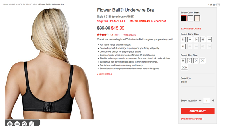
The clearest read on this work is the December 2017 capture of the live page. Three years after delivery, the specified structure was still doing its job: breadcrumb trail into the category, band and cup selectors as separate stepped controls, a sizing help link sitting directly beside them, star rating and review count promoted to the top of the page, and color selection carried as swatches rather than a dropdown. For an apparel PDP — a template most brands rebuild every eighteen months — three-plus years in production is a long life, and it suggests the hierarchy held up against merchandising pressure that a weaker structure would have absorbed.
What I'd improve next
I would analyze the BazaarVoice customer sentiment comments the site was already collecting. The reviews were treated as a feature to place; they were also a standing corpus of unprompted evidence about fit, comfort, and where the product descriptions were failing shoppers. Reading them for themes would have grounded the design in user language rather than stakeholder assumption, and would have given the engagement a research plan to hand forward.
I am grateful for my partnership with Artisan Talent and the client stakeholders at Hanes who were committed to allowing the voice of the customer to appear on the product detail page and trust customers to describe the quality and fit of the products to build trust with potential customers.