Tana Green

Lead UX Designer at Oxford Technology Ventures, a contracted parter on The Bloc's Novartis account. I owned UX strategy, sitemaps, and workflows. After my engagement, The Bloc's UI and development team produced the live build directly from my strategy documents.



Menveo.com was the branded launch site for a new comprehensive vaccine. It was the first to protect against five global strains of meningitis. This site's job was to move a clinical audience of doctors and hospital administrators from first understanding the vaccine to ordering it, with the compliance content a pharmaceutical purchase requires. I led the experience end to end: strategy, information architecture, sitemaps, and workflows. Thus, I owned the experience design decisions while a separate team handled the UI build and development.
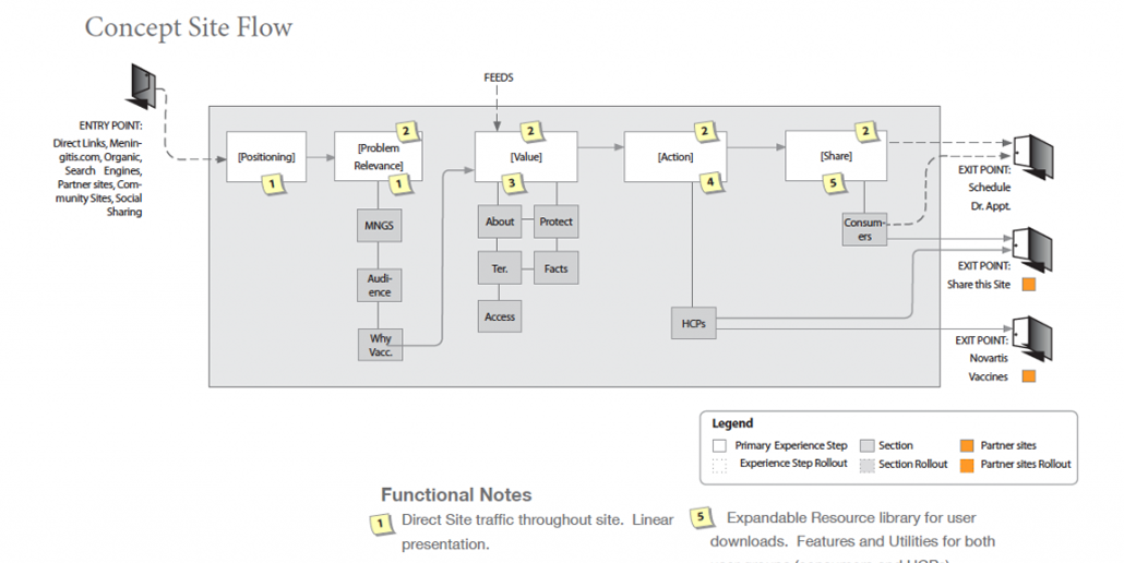
The North Star was a single, disciplined idea. The site should deliver information as carefully and directly as a needle delivers serum. There should be no wasted motion between a customer's question and the answer. From that principle I structured the experience as a deliberate sequence: establish product positioning, demonstrate relevance, prove value, and enable action. Each stage earned the next, so a physician or administrator could move from "what is this" to "order it" without backtracking.
The architecture resolved into a small set of purpose-built pages: an About page introducing the vaccine, a Value page spelling out what Menveo offers clinicians and the patients they treat, and an Action page carrying users toward purchase. Ordering ran directly through the manufacturer, with the required compliance content built into that path rather than bolted on. Visually, the design stayed clean and clinical while carrying forward a motif of colorful magnets anchoring discrete modules of content.

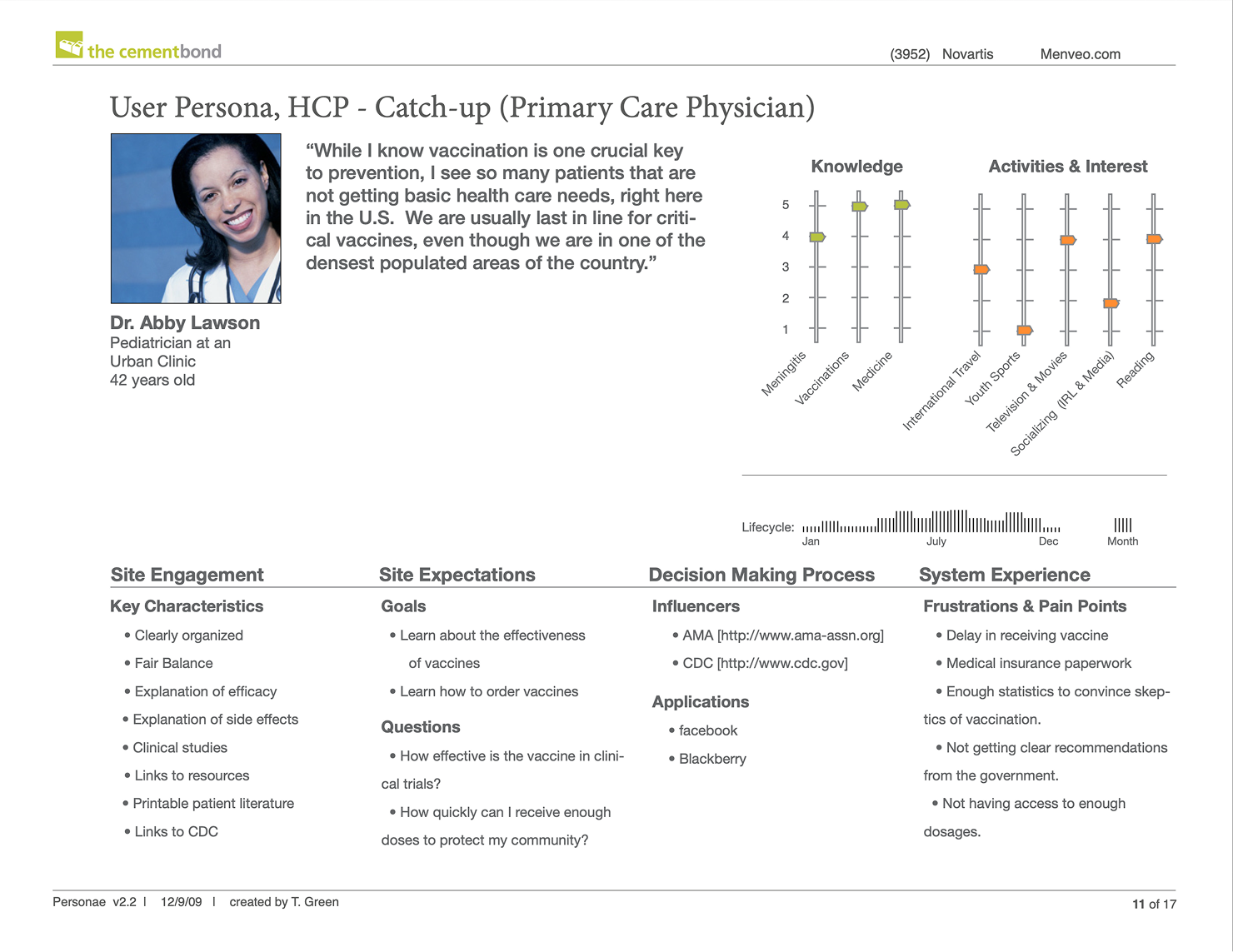
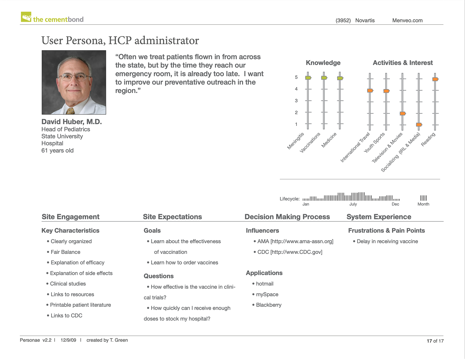
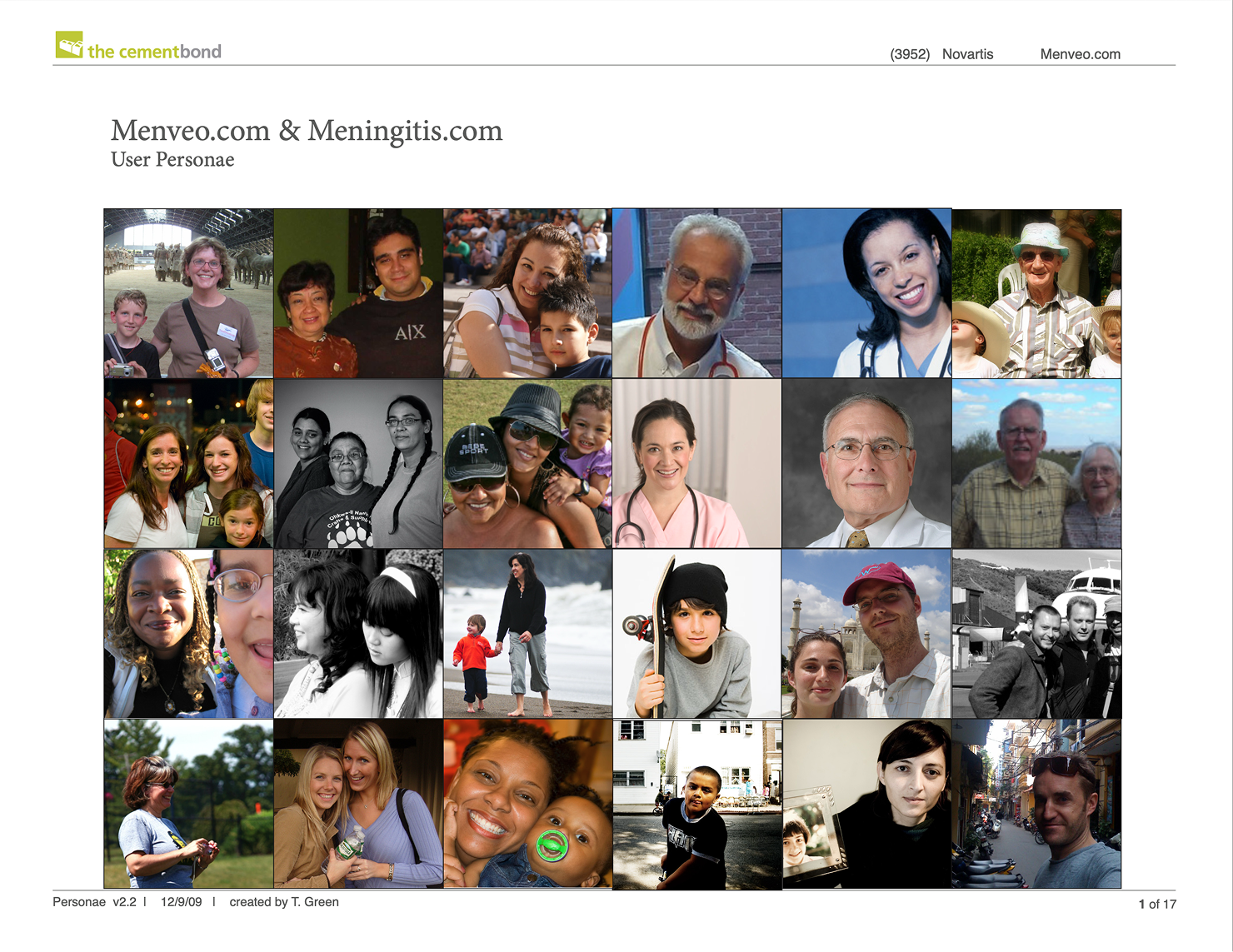
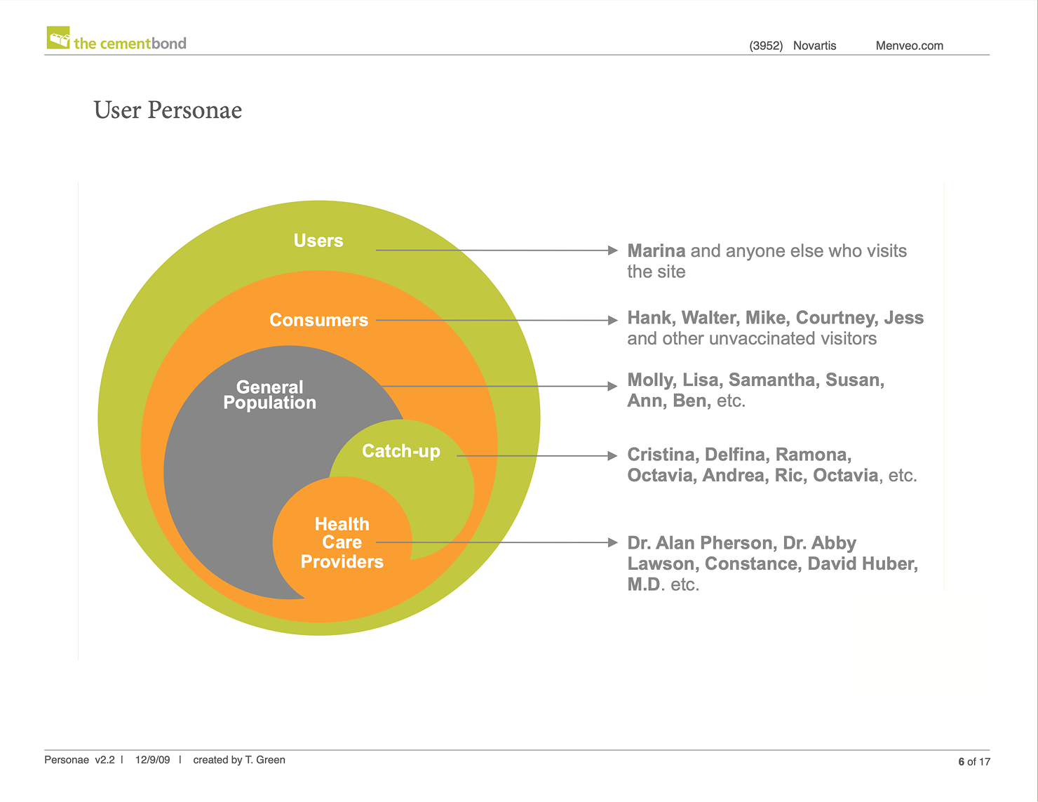
With the site flow, sitemap, and persona needs defined, I translated the strategy into low-fidelity page wireframes. One wireframe for each experience step, from Positioning through Problem Relevance, Value, Action, and Share. Each page carried its concept intent forward and made it buildable: annotated components, a 990×575 layout tuned for 1024×768 screens, and a primary content area scaled down for mobile, with header, navigation, feature, and footer zones specified. Persona cues and calls to action were placed directly in the layouts so page structure answered real clinician and consumer needs rather than filling a template. I also wireframed alternate directions. This included a "Tree Vaccine" concept and a "Kids Share" social variant so stakeholders could compare approaches against one consistent structure. Versioned and dimensioned at scale, the set served as a specification the UI design and development team could build against directly by component, layout, and responsive behavior resolved before a line of production code.

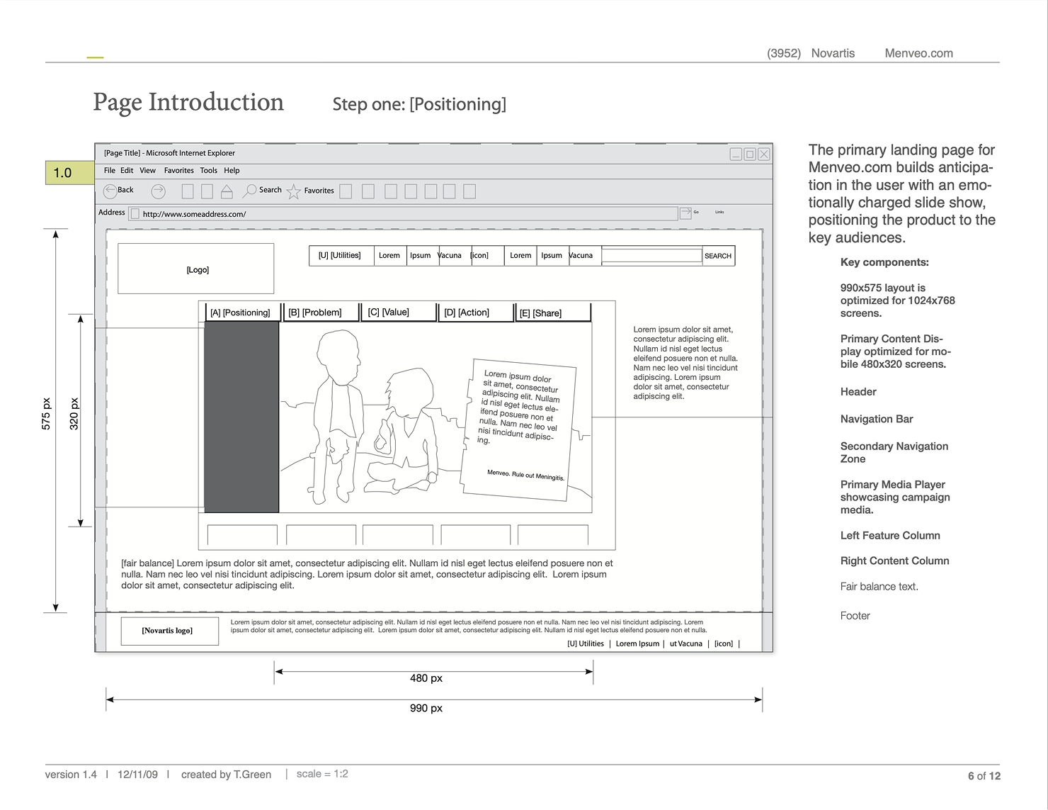


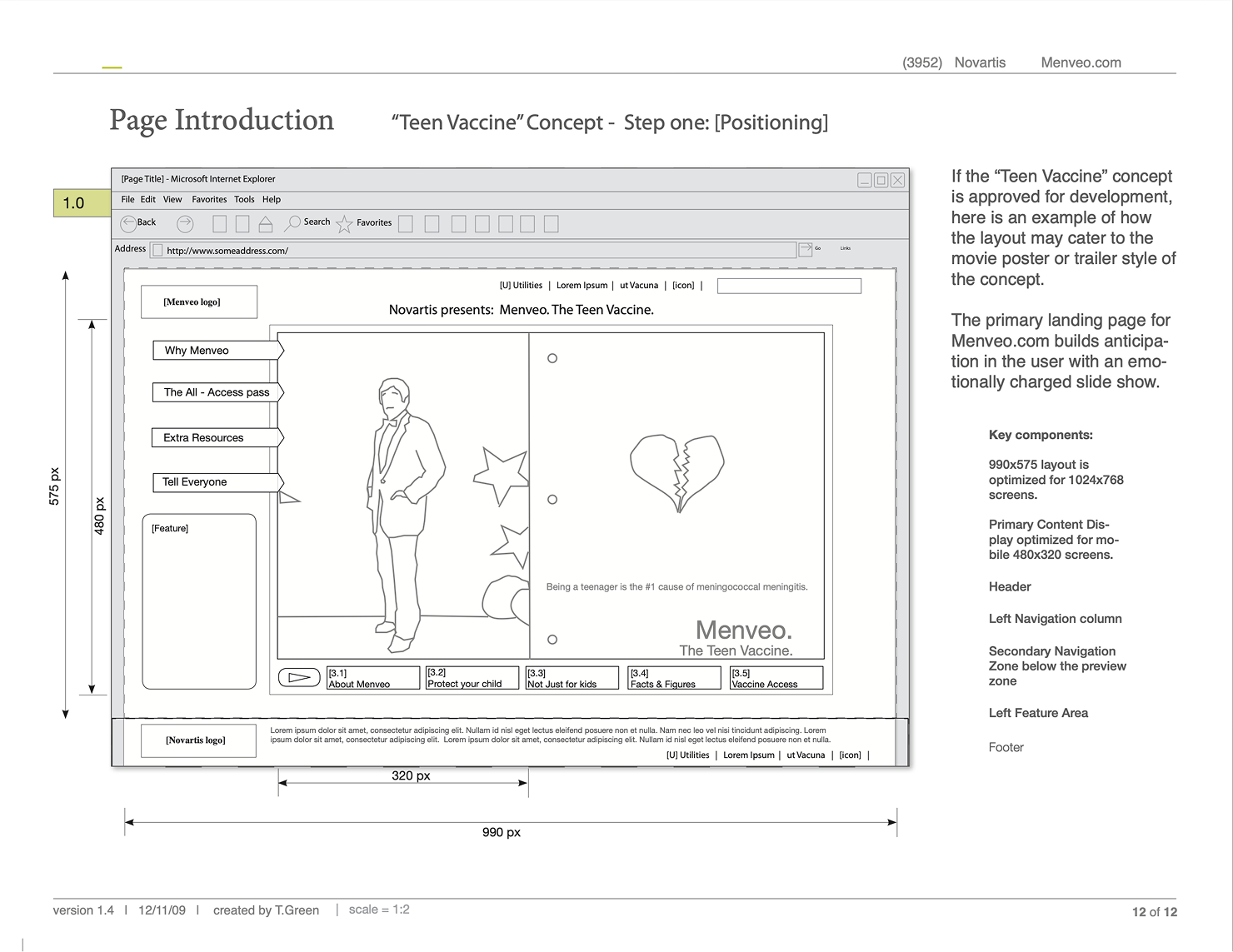


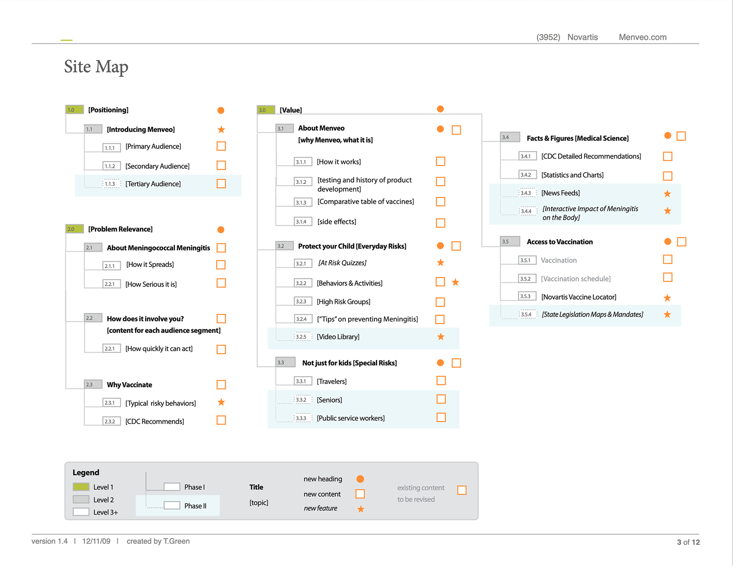
I packaged the UX strategy (concept, site-flow, IA, sitemaps, and workflows) as a build-ready specification, so the downstream team could produce the live pages without re-deriving intent. That handoff is what kept the shipped site faithful to the original strategy even though a different team executed the visual design and development.
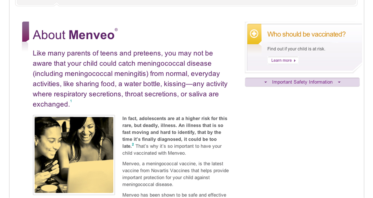
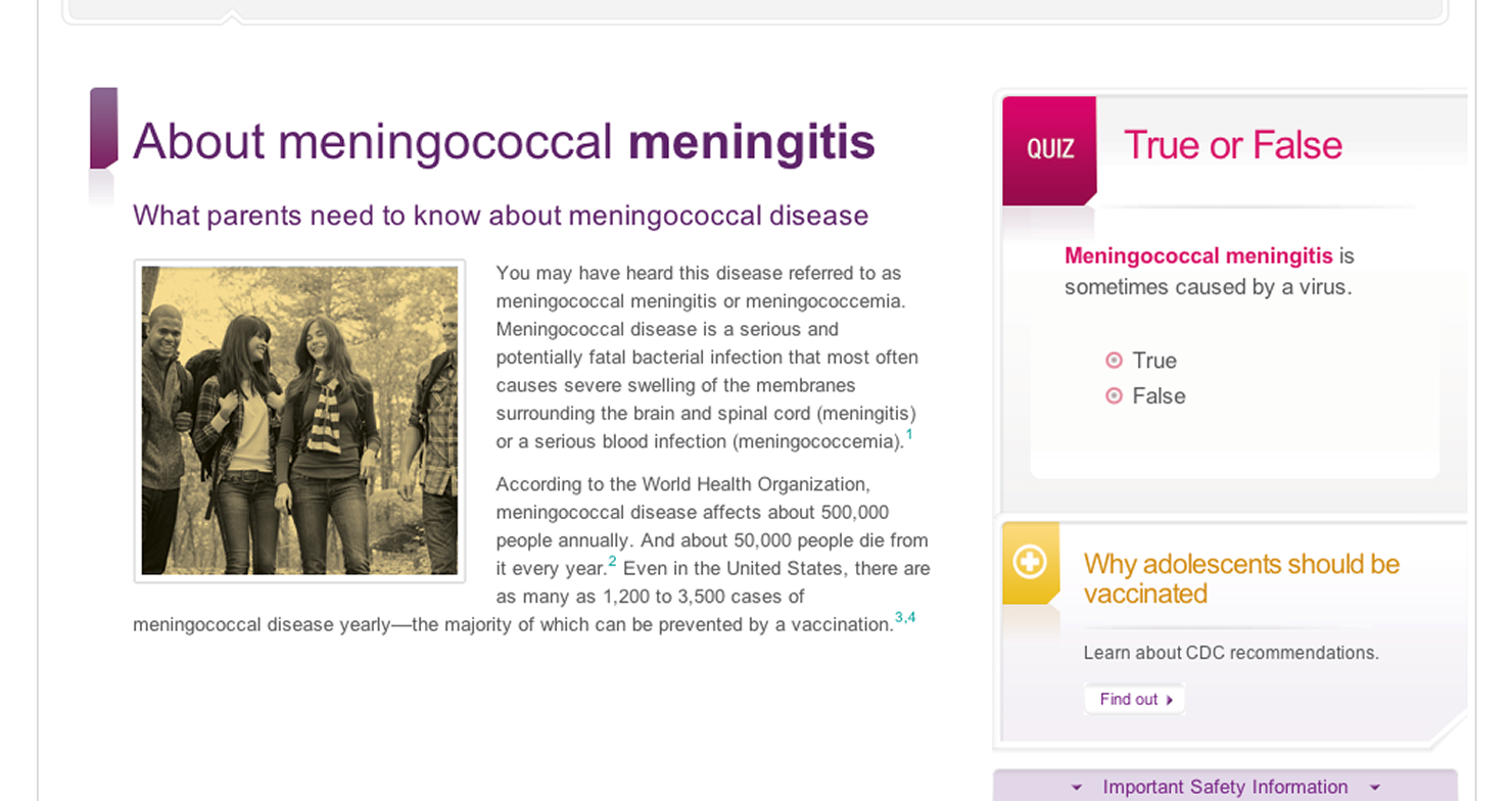
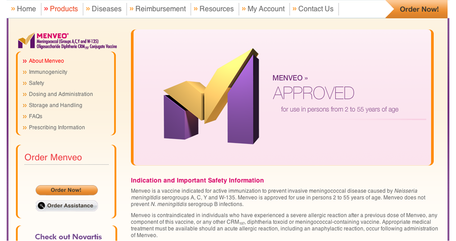
The site shipped and did its job: a clinician arriving cold could leave having placed an order, with compliance handled along the way. Because the final UI was built by others from my documents, the launch also tested how well a strategy travels. The concept metaphors and wireframes survived into the shipped product.
What I'd improve next: I would instrument the funnel from the start, defining ordering and engagement metrics during strategy so the sequence could be validated against real behavior rather than assumed and I would document the patient-site-to-clinician-site handoff as an explicit cross-experience flow.
Nothing here happened alone, and it shows in the work. Aya made the referral that brought me to this project; Matthew sponsored the opportunity and facilitated the workshops where the concepts took shape; and Beverly managed the engagement, clearing the path so the strategy work could stay focused. Generous introductions, steady advocacy, and room to do the work well. I’d work with every one of them again!