Tana Green


Engaged through Tangible Places (d/b/a UX Horizons) for Embodied Media Systems, on referral from a long-time collaborator. Sole UX/UI designer on a three-person team, owning brand identity, interaction model, and screen design end to end. 0.25 FTE across twelve months, roughly thirteen weeks of effort, alongside concurrent engagements.
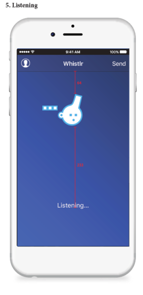
Design: app icon/brand mark, core UI screens (listening/whistling states, security check), marketing/use-case illustration.
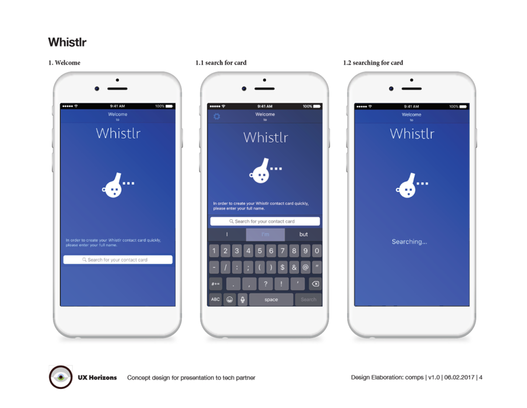
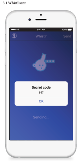
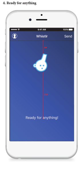
Whistlr let people exchange contact information by whistling a tone between two or more nearby phones. A long-time collaborator brought the project in; engagement ran through UX Horizons for Embodied Media Systems, with sole ownership of UX/UI design on a three-person team. Because the product centered on a protocol nobody had used before, scope ran from defining what the brand should feel like — friendly, simple, a little playful — to specifying how the interface would communicate its two technical states, and how to keep a stranger's contact data from being intercepted mid-transmission.
Whistlr was designed for the moment two people want to exchange details and neither wants to spell out an email address: in a conference hallway, at a colleague introduction, or a coffee shop. The competing methods each carried friction: NFC required physical contact and hardware parity, QR required one person to open a camera and the other to display a code, and Bluetooth requires pairing. Sound required only that both phones be present and listening with the app open.
North Star
A person should be able to use Whistlr correctly the first time, in public, without being taught.
Principles
Trade-offs
Brand and interaction were prioritized over feature depth — no contact history, no editing, no multi-card management in the shipped scope. For a protocol with no precedent, comprehension on first use was the risk worth spending the budget against.
The starting point was brand. Sketches led to a mark called the "rockabilly whistle-bot". The whistle's circular body became a round head, its mouthpiece became a high cowlick in the style of a 1950s rockabilly haircut, and the lanyard loop became an ear. A repeating three-square motif represented sound moving in packets, doubling as the visual cue for whether the app was in listening or whistling mode — its only two states, and the core of the interaction model.
Around that mark, the rest of the UI stayed deliberately minimal: a blue-black gradient background for visual weight, with plain-language instructions placed directly below the icon so a first-time user could understand a genuinely new interaction pattern without onboarding. Because the product transmitted personal contact information as audio in public rooms, security needed to be visible, not just functional. A three-number security check was conceptualized so a user's whistled data couldn't be casually intercepted or replayed by an unitended someone nearby.
.
Whistlr reached the iTunes Store. This was a real outcome for a product with no interaction precedent to inherit. Every design decision had to be original and legible on first contact, and the app arrived with a brand mark, a two-state interaction model, a full screen set, and the marketing scene at the top of this page, all delivered by a single designer.
What I'd improve next
An audio-first product has an obvious accessibility question at its center, and I didn't ask it. Whistlr's states were communicated almost entirely through visual motion and color on a gradient: no haptic confirmation, no VoiceOver consideration for the listening/whistling distinction, and no contrast check on the instruction copy against the blue-black field. For a product whose entire premise is that sound carries information, the missed opportunity to design for people who don't hear it, or don't see the screen confirming it, is the gap I'd close first.

This one belonged to the team as much as to me. Nick brought me into a genuinely odd, genuinely good idea and trusted me with its face — the brand, the interaction model, and every screen. He and the wider Embodied Media Systems group turned a sound protocol into something real and durable. Curiosity, candor, and a shared appetite for the unproven. What a team!