Tana Green


Designed and developed with the creative team at C&G Partners, LLC, Agency of Record for LIIF, following C&G's redesign of the LIIF logo. Ms. Green was an independent consultant at Tangible Places to C&G Partners for LIIF, owning research synthesis, sitemap, and a 26-page wireframe set; UI design and development were delivered by the C&G team from her wireframes.
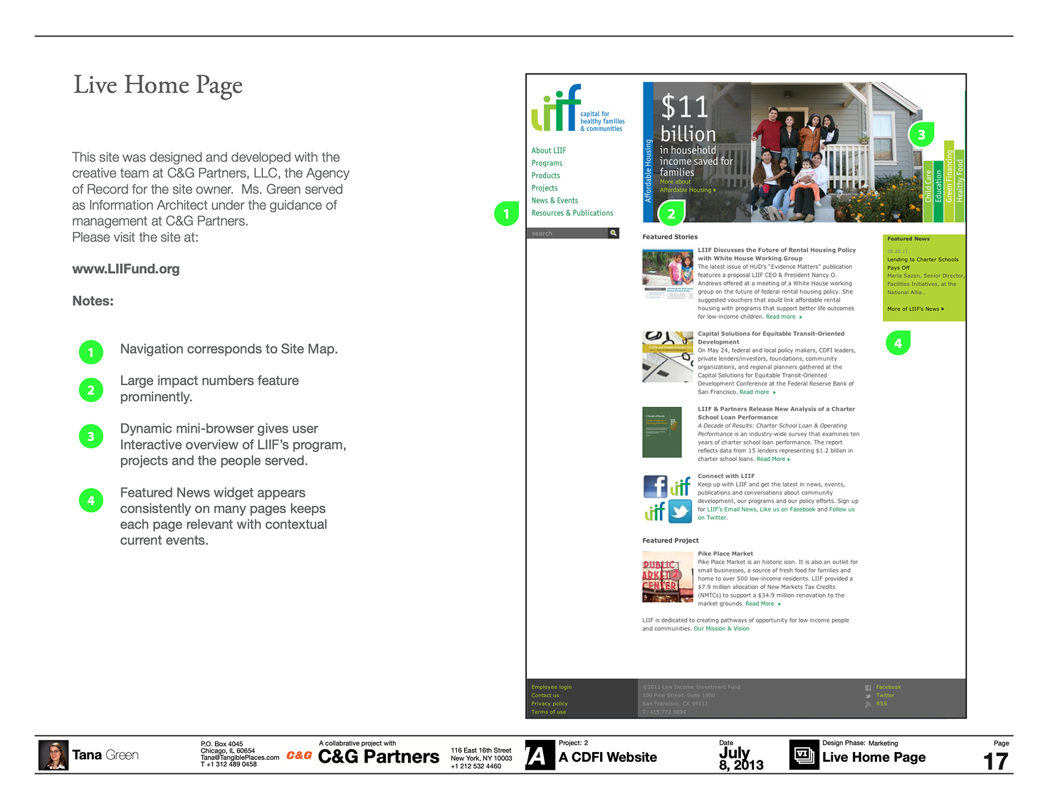


LIIF's website had to do three jobs at once: promote the organization's mission, showcase its grant and loan offerings, and connect both to proof of impact in communities. It was doing none of them well. Nine weeks (May to July 2010) covered discovery through a delivered sitemap and 26-page wireframe set, a compressed schedule for an organization whose content spanned affordable housing, education, child care, health, and transit-oriented development. The constraint shaped the method: one round of stakeholder research, one content model, and a template system flexible enough to hold the whole site.
The audit surfaced the core problem: mission, financial products, and outcomes were presented in isolation, so a visitor couldn't follow a grant or loan from the goal it served to the building it produced. Employees and customers described the organization differently enough that neither view was navigable from the other and the site was built on only one of them. One stakeholder need shaped the template system in particular: the remote policy development office in Washington, DC, which had strong content but no structural way to borrow the organization's impact statistics, project stories, and news.
The organizing insight was a three-category content model: Programs express LIIF's philosophical goals; Products are the grants and loans that fund those goals; Projects are what those products built in communities. Rather than a conventional About/Services split, the entire site hierarchy was structured around this chain, with news posts and impact statistics tagged to each element so proof travels with the content it supports. The trade-off: a deeper, more interlinked structure managed through a persistent left navigation, accepted because LIIF's content volume rewarded findability over flatness.
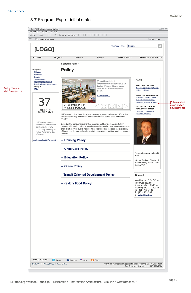
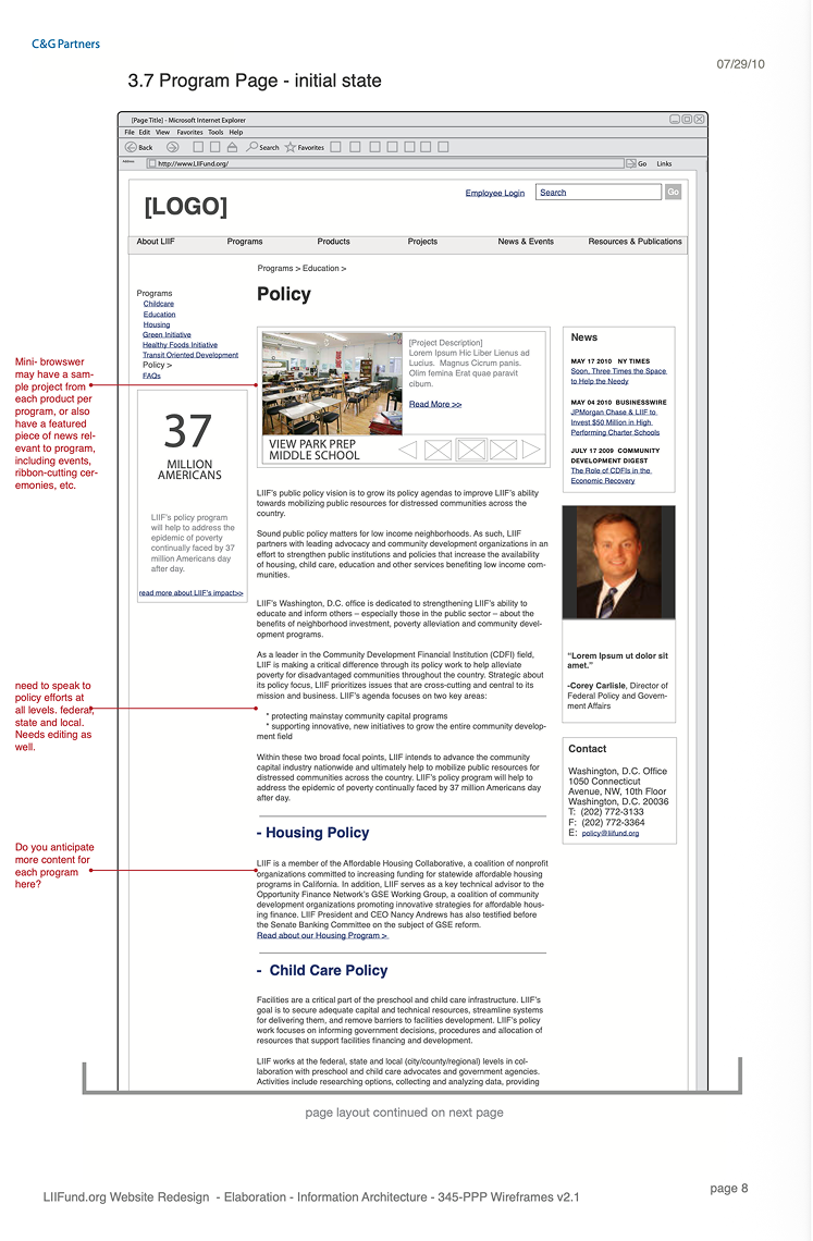
One template format carried the entire site. Each page pairs deep content in a persistent left navigation with widget modules that lead with a single large impact number, then ground it in an end-user photograph and testimonial: statistics and human evidence at every level of the hierarchy, not only the homepage. The format scales without modification from a deep program page like Capital for Green Facilities up to a top-level page like Our Projects or Homes. The policy page proved the system's reach: the remote DC office could compose a complete page from shared impact statistics, funded projects, news, and the policy director's headshot, without producing dedicated content of its own.

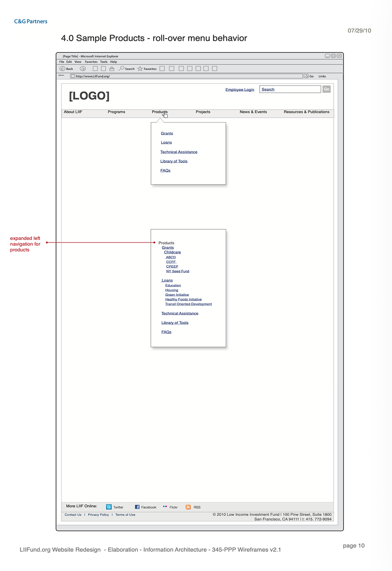


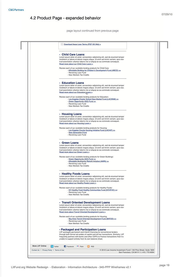
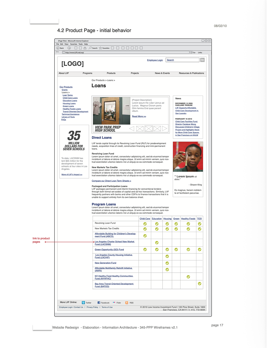
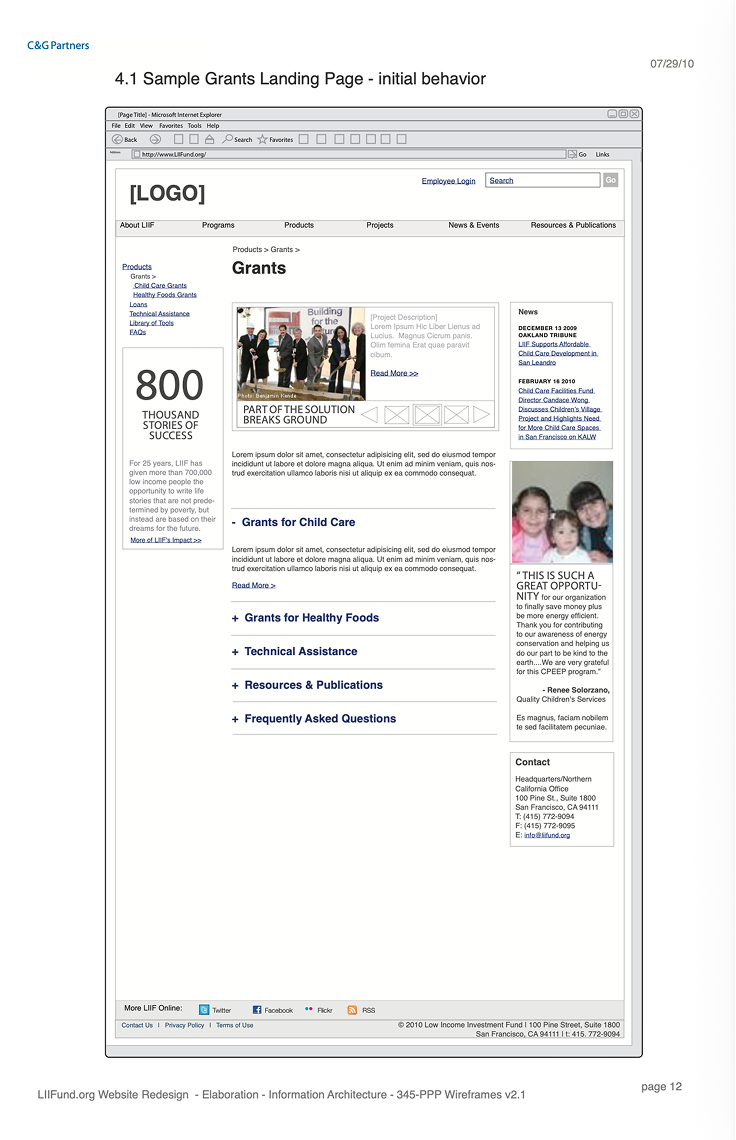

Delivered under WCAG 2.0, then the current W3C Recommendation. The information architecture was structured consistently with the Perceivable and Understandable principles: the Programs → Products → Projects hierarchy and its tagging system express relationships structurally rather than visually (SC 1.3.1 Info and Relationships), wireframes defined a meaningful reading sequence for content and impact-stat modules (SC 1.3.2), and the single template system with persistent left navigation provided consistent navigation and component identification across every level of the site (SC 3.2.3, 3.2.4). Conformance was not in scope; markup-level implementation was delivered by the agency's development team.
The engagement ran in two phases borrowed, deliberately, from architectural practice.
Discovery functioned as programming. I conducted interviews with LIIF employees across programs, lending, policy, and communications, and with customers: the borrowers, developers, and community organizations on the receiving end of LIIF's grants and loans. Employee interviews surfaced how the organization understood its own work; customer interviews surfaced how people arriving with a need actually searched for it. The gap between those two accounts is what produced the Programs / Products / Projects model. Synthesis produced the feature lists that set scope.
Schematic design translated that structure into form: the sitemap fixed the hierarchy, and the 26-page wireframe set resolved each template's content, navigation, and module behavior at annotation level. This was a digital equivalent of schematic drawings, resolved enough to build from, loose enough to still revise.
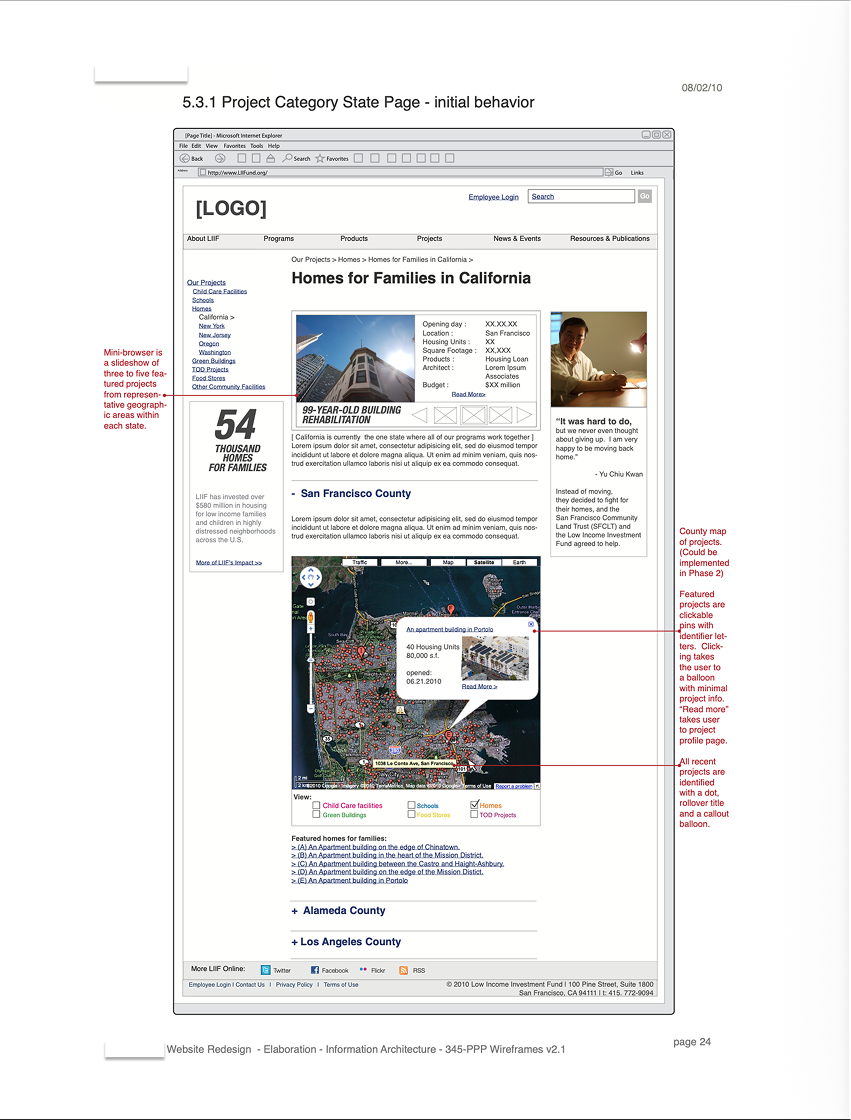
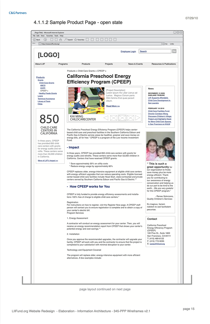

Front-end implementation, CMS build, and QA were owned by C&G; my scope closed at approved wireframes. The launched Capital for Green Facilities, Our Projects, and Homes pages each trace screen-for-screen to that set.
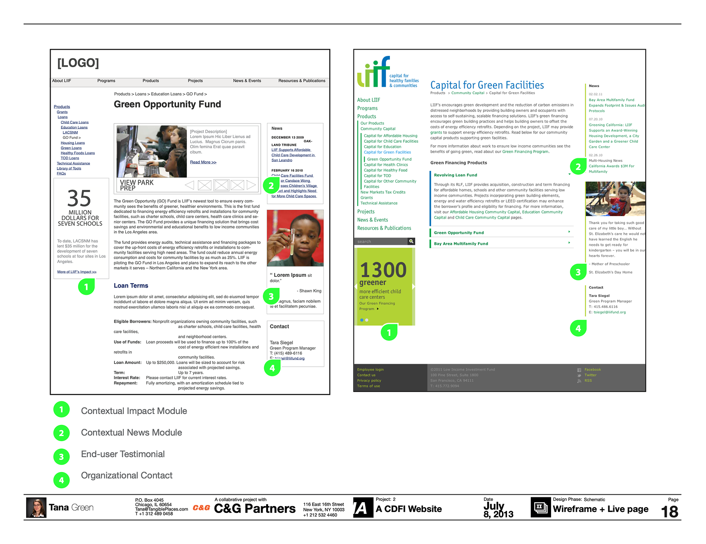

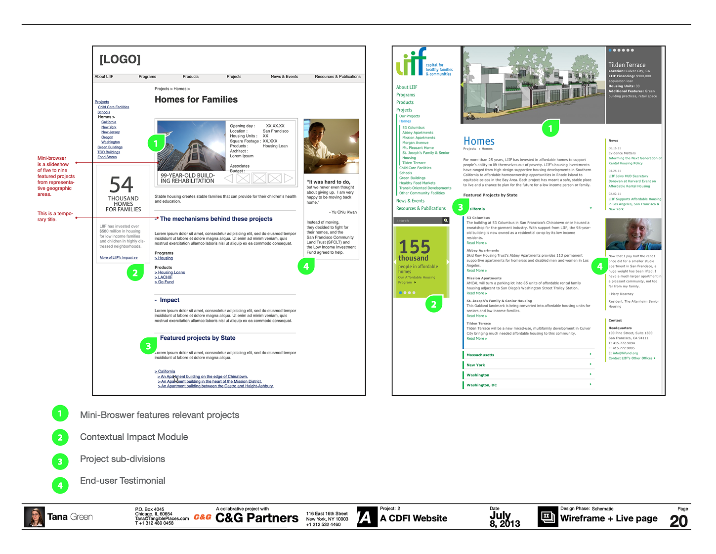
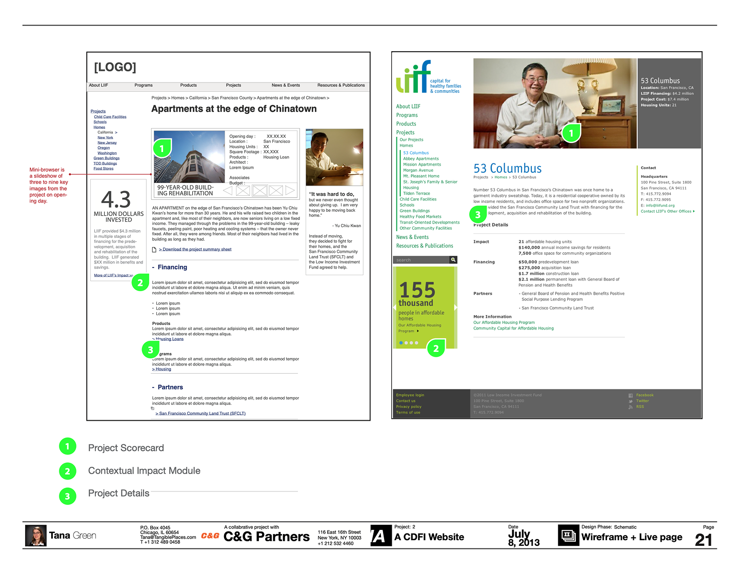
Fifteen years on, the Programs / Products / Projects model remained the most durable aspect of LIIF's adapted website. This content structure and visual commuication was still legible long after the 2010 visual design stopped being current, because it described how the organization actually works rather than a visual trend at the time.
What I'd improve next: define post-launch success metrics before the sitemap rather than after launch, including funder inquiries, product-page entry paths, policy-page engagement. The client's written endorsement was real, but an endorsement is not a measurement, and I finished the engagement without a way to prove the structure performed other than the duration.
This one arrived by way of a generous introduction. My classmate Maya made the referral that brought me to C&G Partners where another Maya digital experiences and set the standard the work was held to. The client stakeholders were a joy and a privilege to work for. They were open, candid, and deeply invested in the people their financing serves. One of the most memorably impactful projects of my career!
Find out more:
C&G Partners
Maya Kopytman