Tana Green


Engaged through my studio, Tangible Places, LLC, under contract to the creative team at Digitas (New York), Digitas held the agency-of-record relationship with American Express; I was the interaction design lead brought in against it, and the sole IxD resource across all three application workstreams. Digitas's Art Director and UI designer owned visual design and production comps, working from my specification. American Express owner representatives set required fields, disclosures, and eligibility rules and held approval; an off-shore development team built. 100% allocation across 26 weeks.
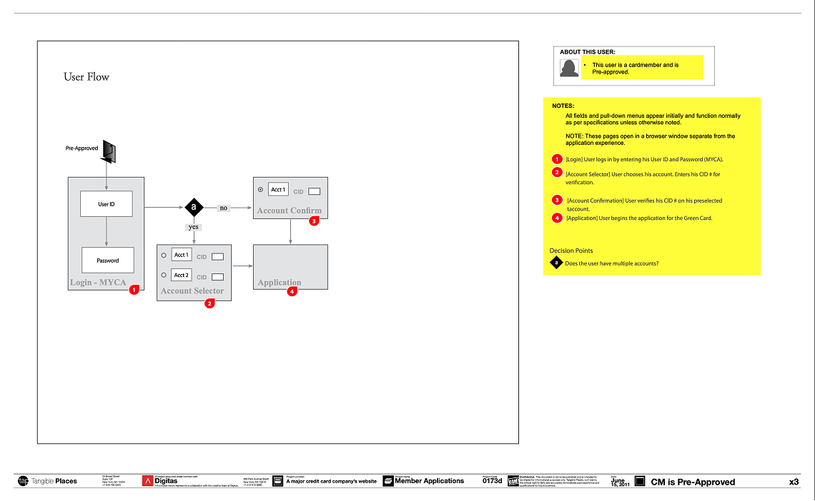


American Express needed its online card applications rebuilt across nearly the entire consumer line: every card carried its own eligibility rules, disclosures, and partner requirements, and each had accumulated its own form. The commercial stake is direct— an application abandoned mid-form is a customer not acquired— and the sign-up form is the only part of a card product every applicant must complete.
I was engaged through Tangible Places under contract to Digitas's creative team as the sole interaction design resource across three concurrent workstreams: Member Applications for existing cardmembers, Partner Applications for co-branded products, and Web Collector for applicants arriving from direct mail and email campaigns. I owned the application template, the step structure, and the conditional logic, and presented that specification directly to American Express owner representatives rather than through an account layer. I did not own visual design or front-end build. Scope ran December 2010 through March 2011 at full allocation.
North Star & principles.
Prioritization.
The application resolved into three steps, each a coherent disclosure of one kind of information: personal details, then employment and financial information, then review and submit. The same skeleton carried every card in the line; product differences were handled as rules against that skeleton rather than as new layouts.
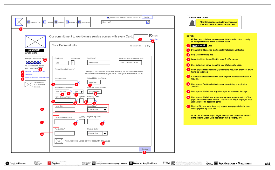
The conditional layer is where the specification did the most work, because the three workstreams shared one template but almost nothing else. Field verification groups were annotated individually, each with its own justification behavior and validation treatment. Home city and state auto-populate once an applicant enters a ZIP code; physical address appears only when a P.O. Box is present in the home address. Panels were specified as variable in height, expanding according to how many fields required verification for a given applicant and card, meaning the layout could not be drawn once and frozen, but had to be described as a set of states. Each behavior was numbered against a functional specification reference, so the off-shore team read the rule and its rationale in the same artifact.
The template's reach is legible in the drawing set. Seven co-brand cards run on a single pre-selected model; two supplemental card products run on another; the Web Collector flows resolve pre-selected and non-pre-approved applicants into the same two-step path regardless of whether they arrived by letter or by email. Where a product genuinely differed, an airline partner's loyalty enrollment, a card art selector, a twelve-digit membership number ahead of the name fields, the difference was specified as a rule against the template rather than as a new layout. Seventeen drawings covered the set.


The six pages below are not six screens. Each documents the same application template under a different applicant condition — a cardmember who isn't pre-approved, an applicant whose entered information failed verification, and so on — because what varied across the card line was the template's behavior, not its layout.
Each page reads in three parts. The form state occupies the page; a numbered red marker sits on every element whose behavior isn't self-evident; and the right-hand column carries the matching notes — field verification groups and their justification behavior, ZIP-driven auto-population, and the conditions under which a panel expands or a field hides. An "About this user" strip heads that column and names the scenario the page documents, so a reviewer knows which applicant they are reading before they read a single rule. The footer carries the document number and version.
That structure was the point. One artifact had to satisfy a client owner representative checking required fields and disclosures, and an off-shore developer building the rule — neither of whom could walk over to ask.


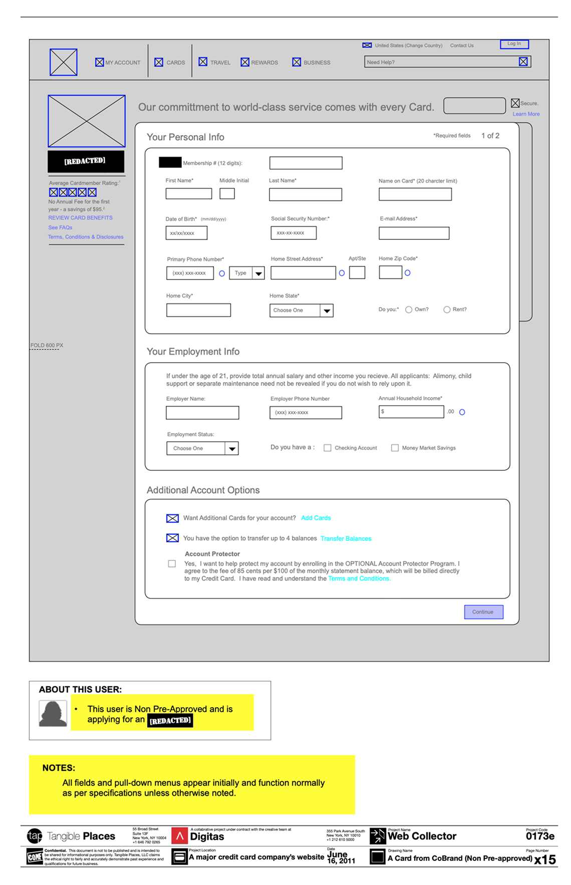
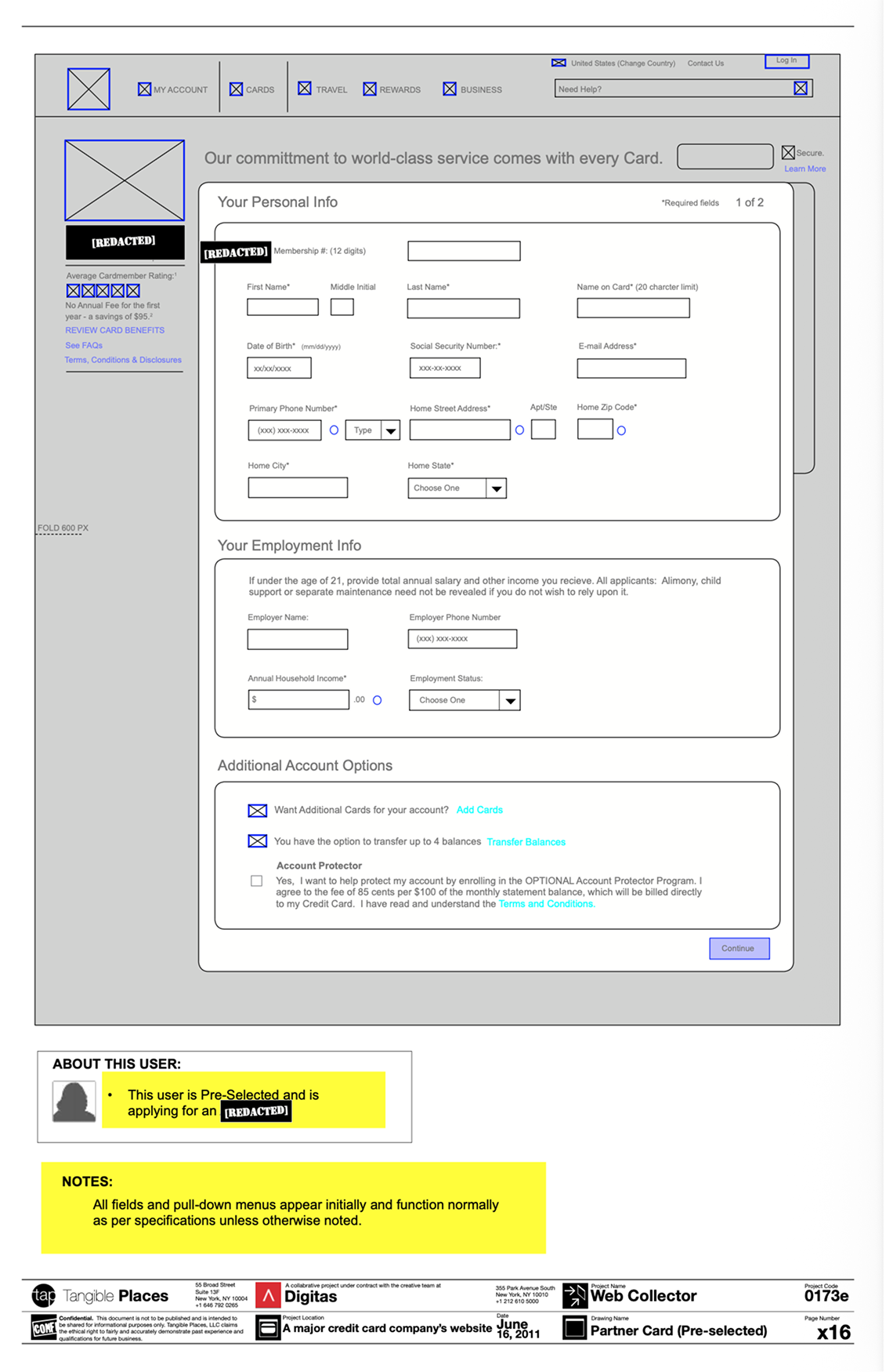
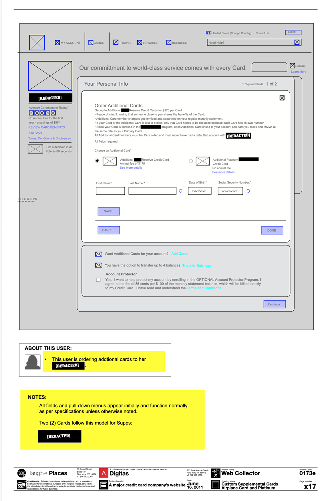
Every wireframe went through joint review with client owner representatives and the off-shore development team before any application moved into visual design, checking requirements compliance and technical feasibility in the same session. That combination mattered: with the build team off-shore and the field requirements set by a regulated client, a rule that was ambiguous in the wireframe would surface weeks later as a defect rather than as a question. The contract structure sharpened this: as an outside specialist under contract to Digitas rather than a staff designer, I had no informal channel to the client or the build team, so anything ambiguous in a drawing was ambiguous permanently. Numbering each behavior against a functional specification reference gave reviewers on both sides (client, agency, and developer) a shared address for every rule.
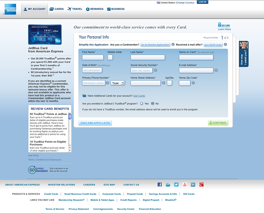
Step 1 — personal information.
Step 2 — employment and financial information.
Step 3 — review and submit.

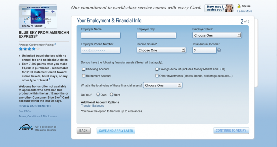
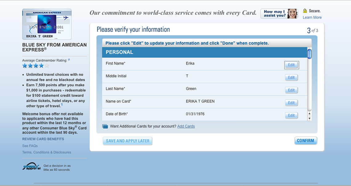
The applications shipped.
Production screens carried the three-step structure through to the live americanexpress.com experience, step indicator visible to the applicant, across partner cards including Blue Sky and JetBlue. The template held across all three workstreams: seven co-brand cards on one model, two supplemental products on another, and the direct-mail and email paths sharing a single application flow — which is what allowed one contract designer to specify the set inside 9 weeks.
Fifteen years on, the step-and-indicator pattern these applications used is still the default for regulated online forms— the structure was durable, whatever the toolset.
Thanks again to bradley backhaus and Digitas for entrusting me with this opportunity last decade. I’m still grateful. I am also grateful to the wider team, whose names I have now forgotten. They were: A product design lead, two project managers, and one lead designer specified a full card line with the MVP template, and delegated the final UI design based on my annotated wireframes for visual comps to her team.