Tana Green

Engaged through Oxford Technology Ventures as primary User Experience Designer, partnering with The Cement Bond, agency of record for the client, under their creative direction. The Cement Bond's in-house UI design and development team executed final visual design and production from Tana's UX strategy concepts, site flow, and content structure.
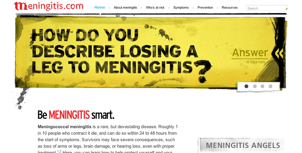
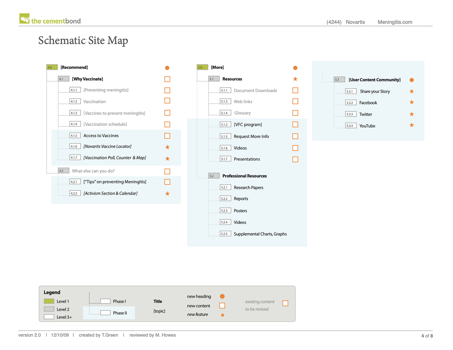
Novartis commissioned The Cement Bond (part of The Bloc agencies in New York) a paired digital campaign to address meningitis risk from two angles: an unbranded public-education site (Meningitis.com) to build awareness, and a companion branded site (Menveo.com) introducing the vaccine itself. This case covers the unbranded site.
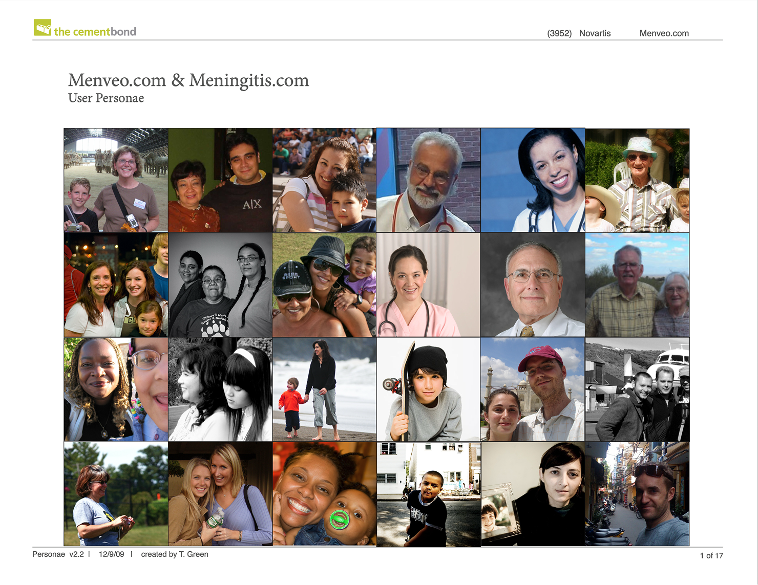
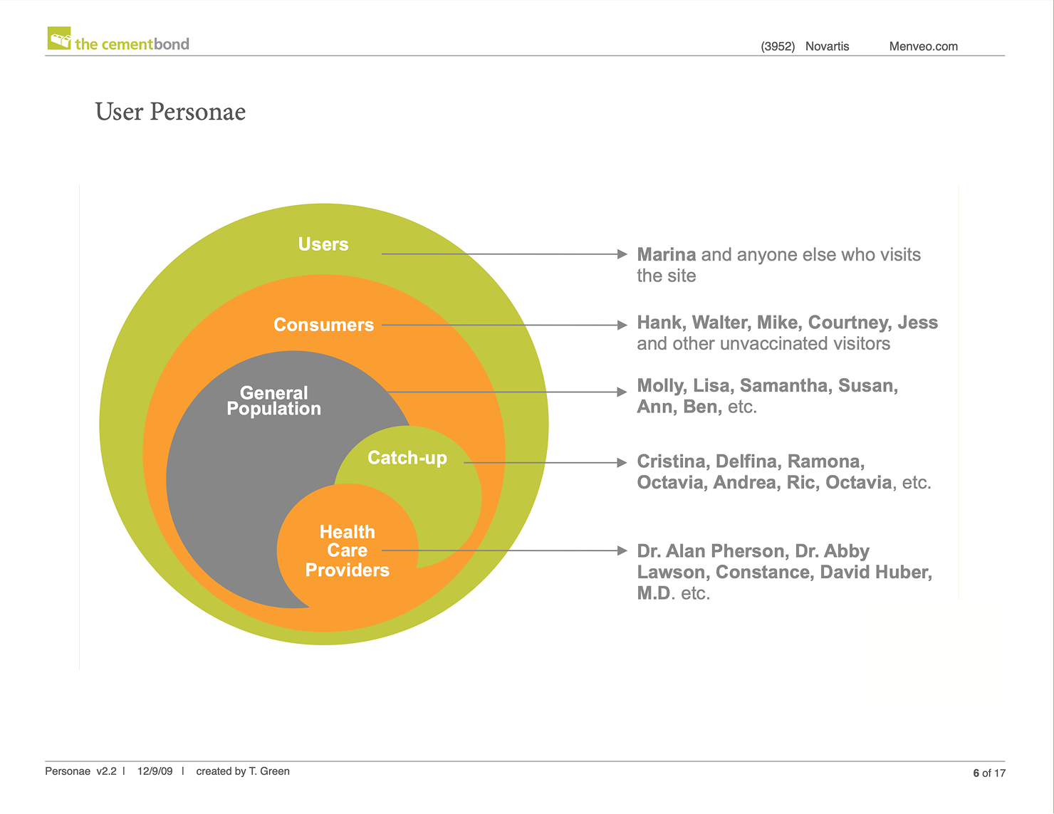
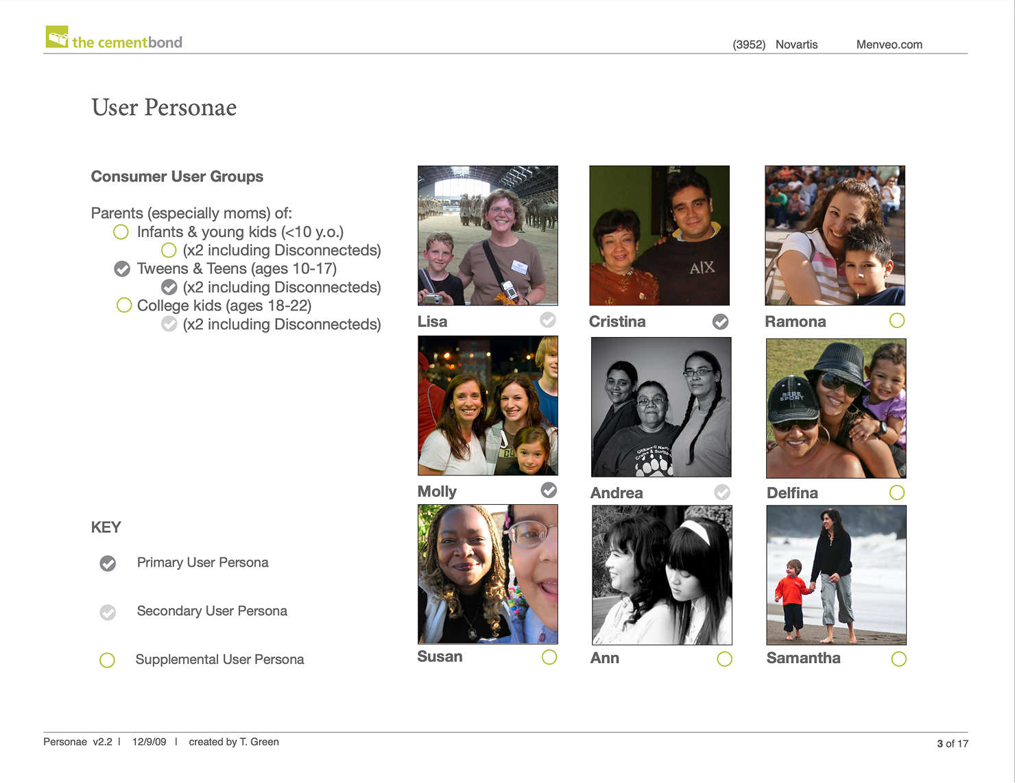
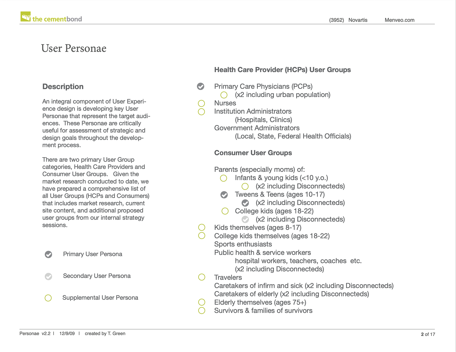
The primary audience was parents of tweens and teenagers; the campaign also needed to reach infants, travelers, and senior citizens. These populations are at real risk but not commonly associated with meningitis. Success meant moving a parent from initial awareness through a structured self-assessment to guidance on scheduling avaccination appointment. Tana served as primary UX Designer, delivering information architecture, site flow, and content strategy. Final visual design and front-end build were executed by The Cement Bond's in-house team from those strategy documents.
The site design needed to broaden the mental model beyond how parents commonly associated meningitis risk with teenagers only to include infants, travelers, and senior citizens without diluting the parent-facing core story. Families needed a trustworthy sequence that converted awareness into a scheduled appointment— not a clinical reference they could browse and leave.
This was the first vaccine to prevent all five global strains of viral meningitis. Novartis wanted to educate the public on the risks of meningitis, and why it should be a standard vaccination for teenagers at risk, as well as other audience groups at risk.
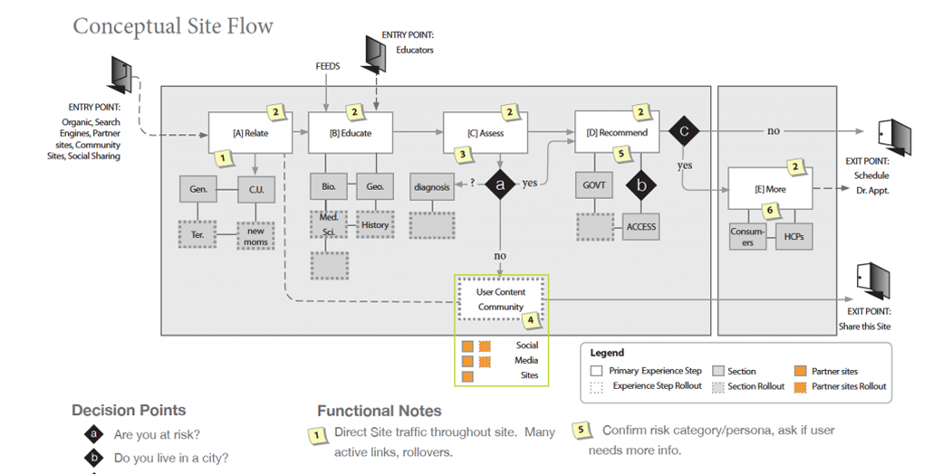
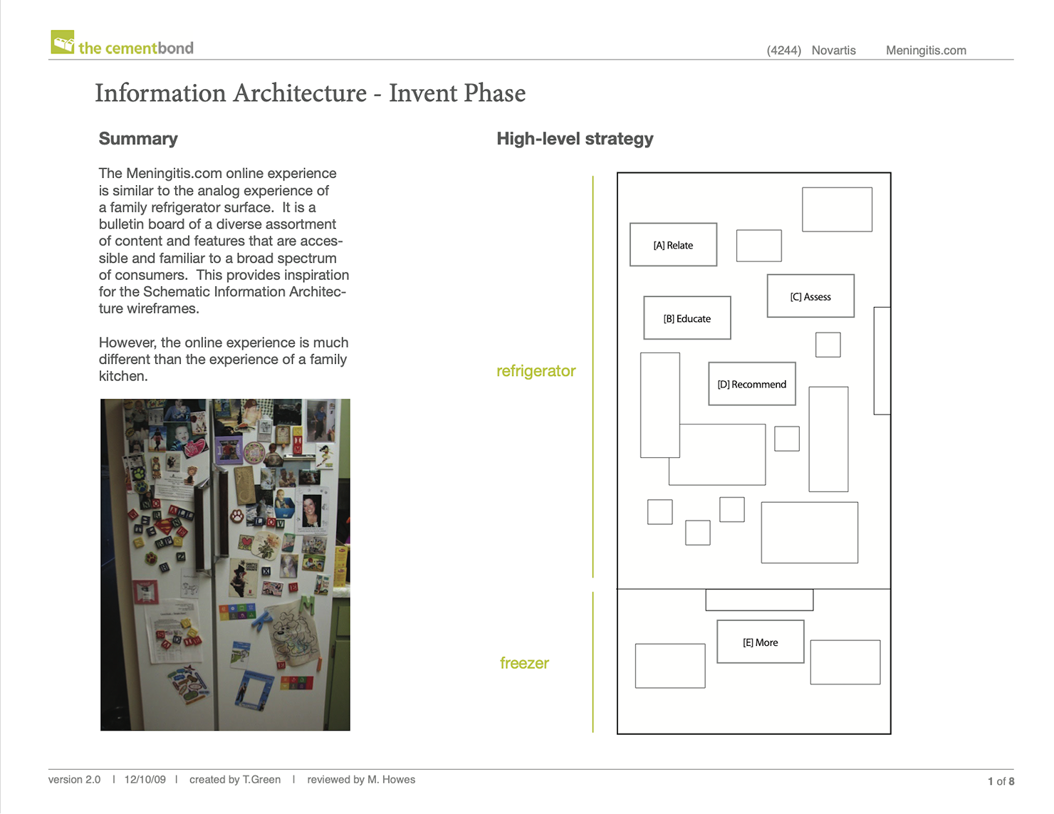
The North Star was metaphorical differentiation. Rather than distinguish the branded and unbranded sites through content alone, each site needed its own visual language. For the unbranded education site, Tana anchored the concept in the refrigerator door, a literal surface where the target audience posts, displays, and communicates family information, to make a clinical health topic feel native to a familiar domestic context rather than a pharmaceutical pitch. Content was structured as a four-chapter journey (Relate, Educate, Assess, Recommend) sequencing users from emotional relevance through self-assessment to a direct recommendation rather than leaving them to browse disconnected pages. The trade-off against the branded site (designed to read as clinical and direct, "as carefully as a needle delivers the serum") was deliberate: the unbranded site needed casual warmth and familiarity to read as education rather than promotion.
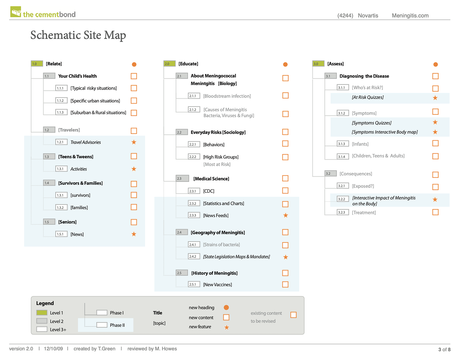
The four-chapter flow functioned as the site's backbone, with each chapter mapped to a distinct user state: emotional relevance, factual education, personal risk assessment, and a vaccination recommendation. The Assess chapter centered an interactive risk-assessment tool letting users evaluate their own exposure, the site's primary conversion mechanism. Content was deliberately widened beyond the core tween/teen narrative to include infants, travelers, and senior citizens (populations not typically associated with meningitis risk) broadening the site's relevance without diluting the central parent-facing story. Visual execution (the refrigerator-magnet aesthetic, color palette, and final UI) was produced by The Cement Bond's in-house design team from Tana's strategy documents and flow diagrams.
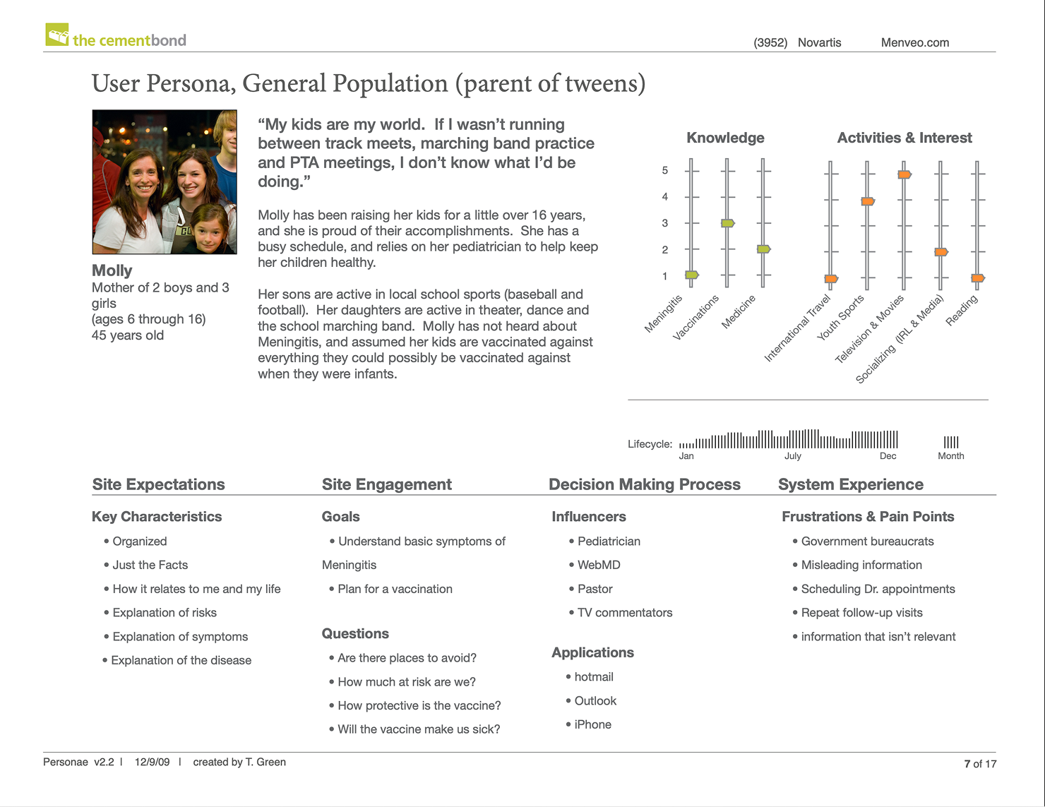
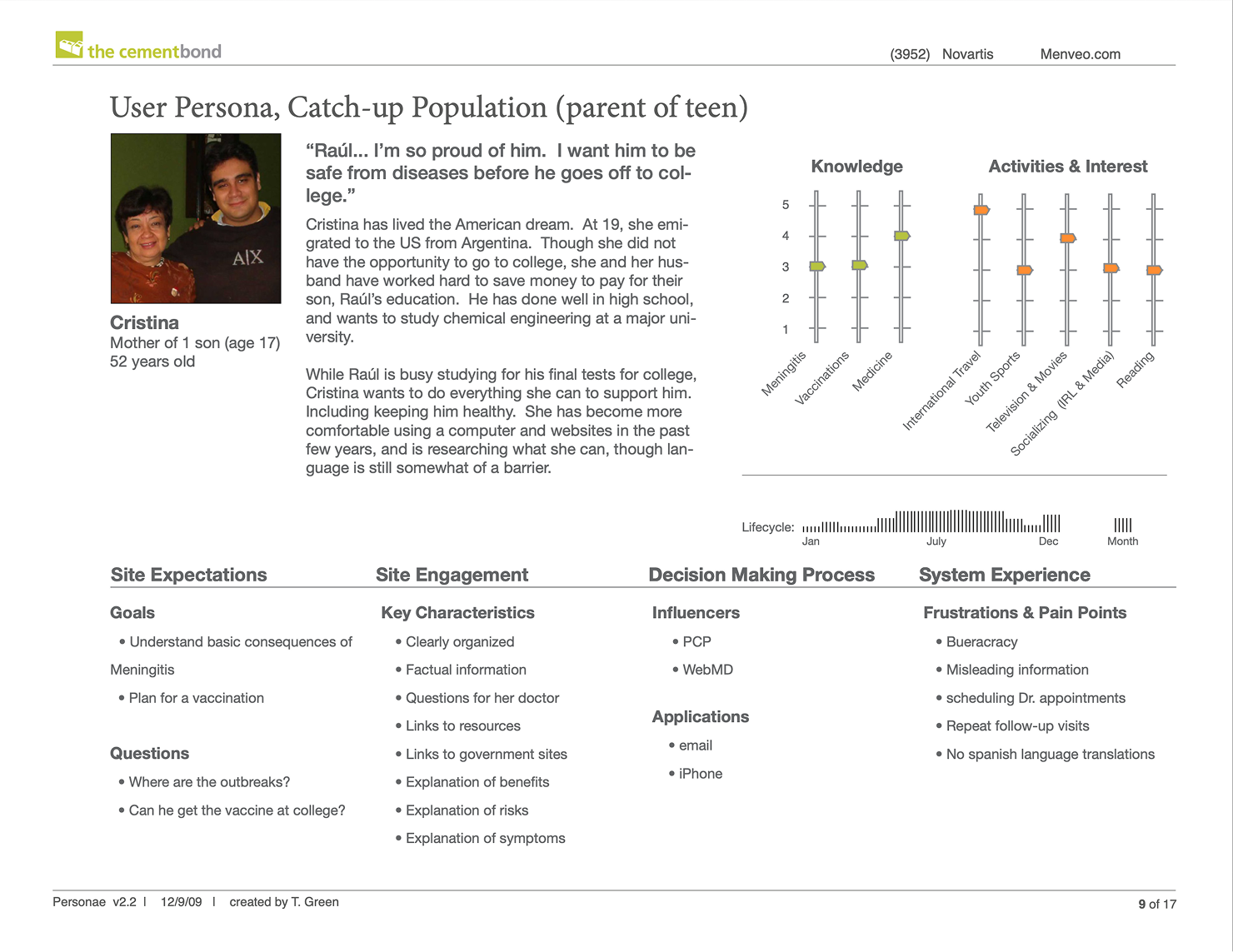
Low-fidelity mockups translated the four-chapter site flow into page level detailed content arrangement documentation. Each page spec paired an annotated wireframe with content requirements, module behavior, and link logic, giving The Cement Bond's UI design and development team a single reference for what each page had to accomplish before visual design began — including the footer allowance required for regulatory disclaimers.
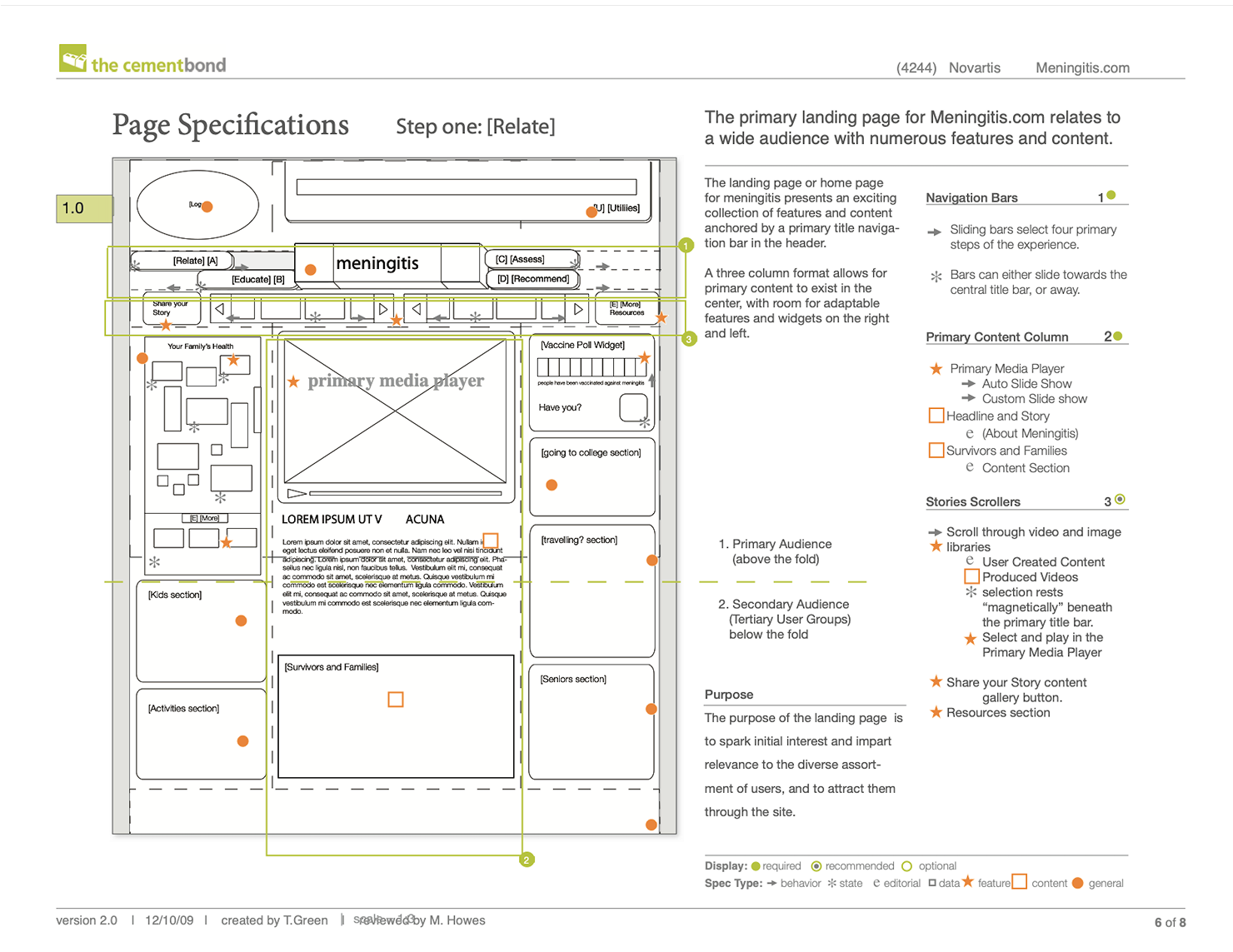
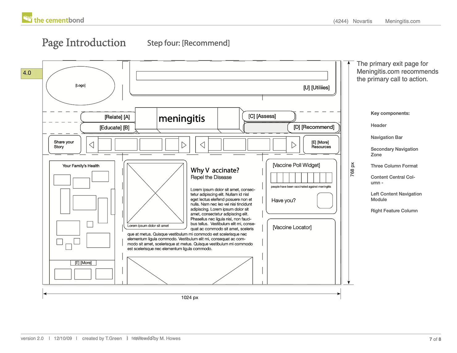
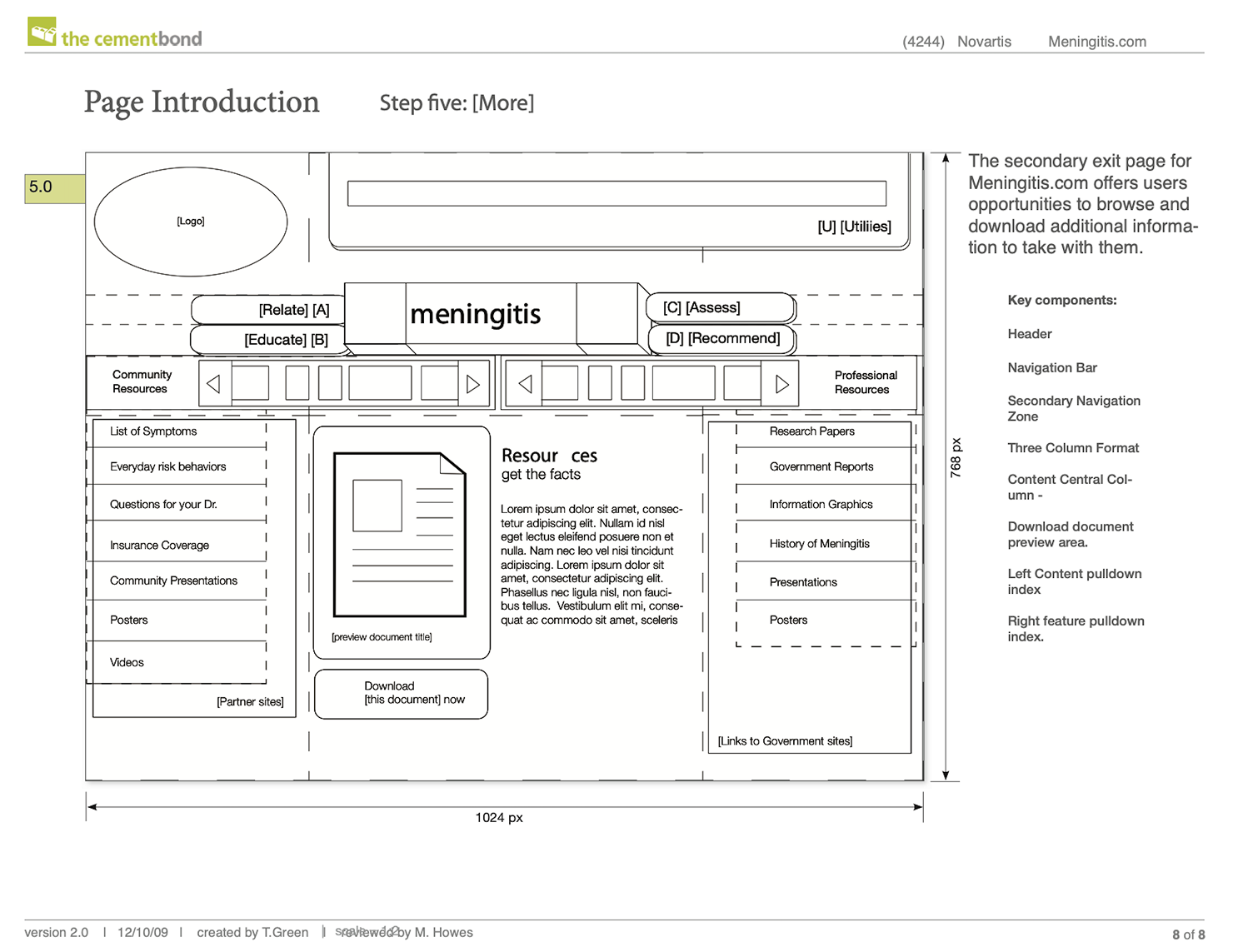
Tana delivered UX strategy concepts, a four-chapter content structure, and a site flow diagram to The Cement Bond's UI design and development team, who executed final visual design and front-end build for production. The page layout was designed from the outset to accommodate footer space for pharma regulatory disclaimers — a requirement that shaped column structure and content density across all chapter pages.
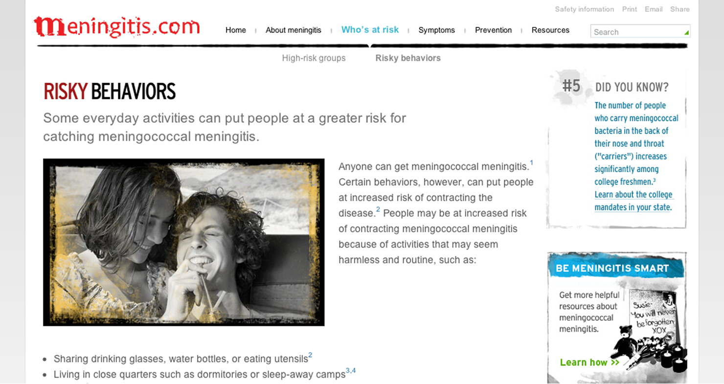


The site shipped to production as the unbranded half of a two-site campaign, pairing risk education and self-assessment with a separate branded vaccine site for conversion.
Nothing here happened alone, and it shows in the work. Aya made the referral that brought me to this project; Matthew sponsored the opportunity and facilitated the workshops where the concepts took shape; and Beverly managed the engagement, clearing the path so the strategy work could stay focused. Generous introductions, steady advocacy, and room to do the work well. I’d work with every one of them again!